After my first stage of initial ideas for the Bicycle Astronomy, I decided to change my kickstarter project because I wasn't interested enough in the project itself.
I looked into the 'food' field on the website, I came across a small neighbourhood restaurant in the US called SER, standing for simple, easy and real. This name represents the business's values and services; real home-made, traditional Spanish meals.


After looking at the language and values the restaurant holds, I made notes and broke down the design specifics I wanted to include. The development of the traditional Spanish tile design involved spending a lot of time drawing out several shapes and symbols derived from existing pattern design, which often consisted of triangles and diamond shapes, as well as more floral curves often shaped like buds of a flower or plant.
I also looked at how these shapes interlink and connect as patterns. Note cut-out grooves and sections that cross over or link up.


This led on to looking at architecture to get more ideas for the shapes that would represent an welcoming, casual environment, where I looked at home entrances to see whether there was anything distinct that gave the impression of openness and hospitality. I also experimented with intertwining curves, considering a border that was made up of several outlined curves twisting in and out of each other. This would symbolise the 'journey and adventure' that the restaurant would guide the customer on through consuming the variety of cultural food.
From this I moved on to looking at geometric patterns, sticking with a shape that stood out to me as being visually pleasing and has been carried forward subconsciously through my development so far. I planned to take aspects of the traditional patterns and take out the elaborate elements, creating a clean-cut modernised take on the original designs. This reflects the modern spin on the traditional Spanish meals that SER will be serving.
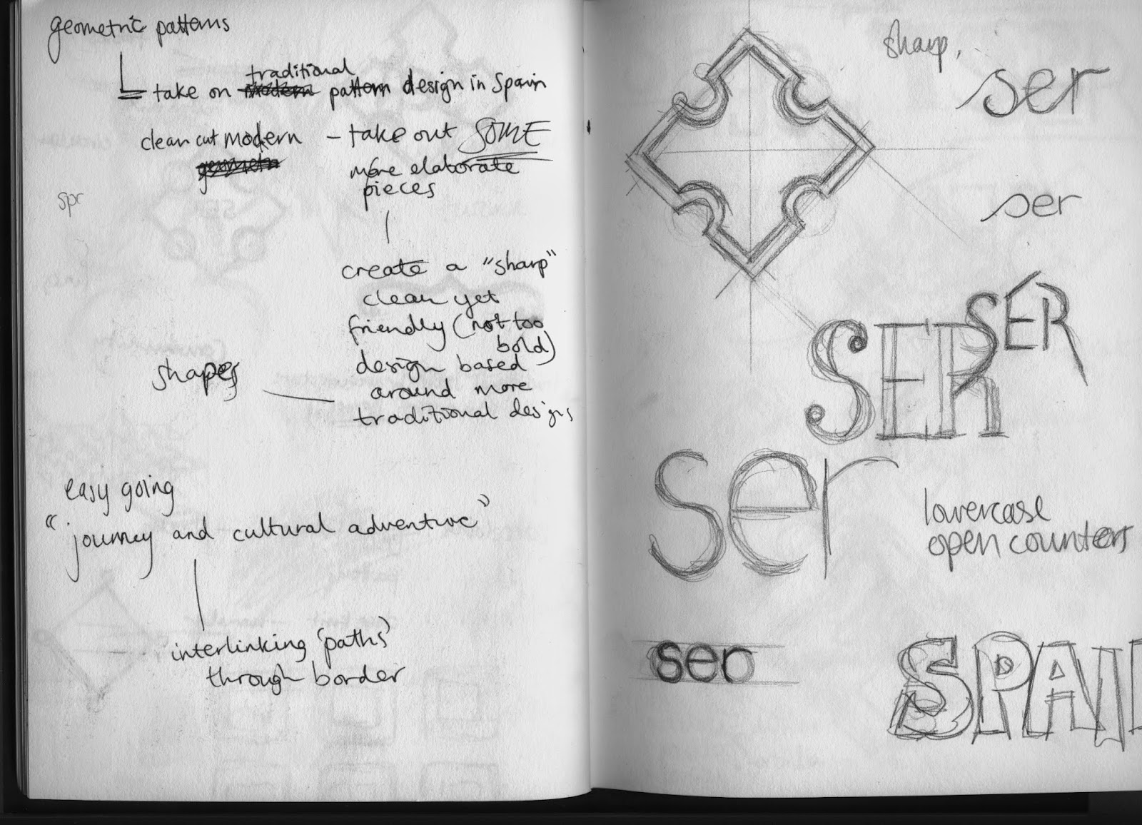
Once I'd found the ideal shape I want to develop further, I took a break from this and started looking at type. My initial line of thinking was to use lowercase letterforms with a large amount of negative space in the counters, which is softer and more inviting than a heavy block typeface would be.
Although I had this concept in mind, I tested out a few different ways I could incorporate the restaurant name into a logo, trying out different line weights as well as in uppercase form, not forgetting that SER stands for Simple Easy and Real - the abbreviation could be overlooked in lowercase.
Wanting to hand render the type anyway, I looked at working the letterforms into a border around a similar, diamond shape, bringing back some features of the traditional art such as smaller filled in diamond shapes within the main one.


Also looked at incorporating two horizontal lines above and below the type, which links in with the directional block strokes on the Spanish flag.
More typeface decisions:
- no sharp edges, slightly rounded to reflect casual, informal atmosphere
- stick with lowercase: uppercase with low x-height looks good but think I could create a more personal typeface which has script qualities
________________
Crit
In the crit today I got some feedback from the group to experiment further with the tile design and possibly incorporate more than one tile into the design.
I was also given advice to look into spanish painters, which has led me to think about painting the logo design, or at least the type for it, as this reinforces the personal, hand(home)-made element of the restaurant.
I plan to research into the colour schemes of spanish interiors as well as the most common colours used in Spanish paintings, so that the public can make connections between SER as a brand and the vibrant Spanish culture.
- colours represent spanish culture
- traditional tiles / traditional spanish meals
- simplified tile design to become more contemporary
- also fits with the simple, easy, sharp brand image
________________


I noted that the design looks better without the two darker horizontal lines, and if I put type laying over this it would become too busy. I've reduced the content in the logo to the image on top right, keeping a border to cordon off the shape, and having the text flowing over the border slightly.
In terms of colour, I want to use natural, organic tones which are cosy and warm - suggestions being burnt oranges and yellows, even warm or deep reds. These would reinforce the cultural heritage, and are evidently Spanish due to the flag colours.
Further fitting with the home-made, raw and honest company values, I've decided to create the basis for the whole logo by hand, using paint to create a coloured background that wasn't a generic spot colour, and showed the authenticity of the brush strokes. To do this I made sure there wasn't a lot of thick paint, and loosely brushed the paint over a patch which I then refined and re-drew the logo over the top.

I tried using more than two colours, but with feedback stating it could be too much and wouldn't work well as a logo, I decided to go against this idea and work with just two - with black on top. The looser, dry strokes of paint work better than block colour, and above shows my experiments with this, realising that the direction of the brush strokes mattered a great deal. To contrast with the direction of type I made the brush strokes for the red/orange background horizontal, for reason that the eye is more accustomed to horizontal displays, i.e. cinema.
Type practicing:


Practice and final logo, painted:

On the final one I kept the diagonal lines on the inner part of the shape fairly thin, heavier towards the border and lighter toward the text. I also didn't outline the outside of the border in black, keeping a soft edge that also pushes it further backwards. A black outline would be too striking and harsh - I like how it almost fades into the surrounding area rather than standing off the page completely. The red paint also shows through the lighter hue of the border which I painted on top of the red.
Below is the scanned in painting that I plan to edit on Photoshop to create the final design.

_______________________


I also tried out a drop shadow behind the four curves in the centre to further give the impression that the centre of the diamond is being pushed forwards compared with the four corners that fall back slightly.


After asking for the feedback from several people I stuck with a brightened version of the logo because the colours stand out more but still hold the earthy, organic vibe that is also present in the brush strokes of the paint.

I also cleaned up the image, erasing any pencil marks or errors.


I also made an outline only version of the logo as a simplistic version of the coloured one. This was traced from the original logo shape in a singular vector line, keeping the consistency throughout different versions. The clean cut vector image is arguably preferable to the final coloured logo.


1. Outlined borders are same stroke width. 2. inside border is thicker to suggest slightly protruding centre. 3. Same as 2, however both lines are made a stroke width thinner to push shape into background, appearing less heavy and distracting from text.
No comments:
Post a Comment