Managed to pick up a lot of wood and cardboard over the past few months, so now I'm nearing the end of my composition and painting development ideas I'm going to plan out a larger composition to fit the pieces together as a whole. I've got a collection of off cuts, packaging and wood found in skips.
Compositional sketches from photographs
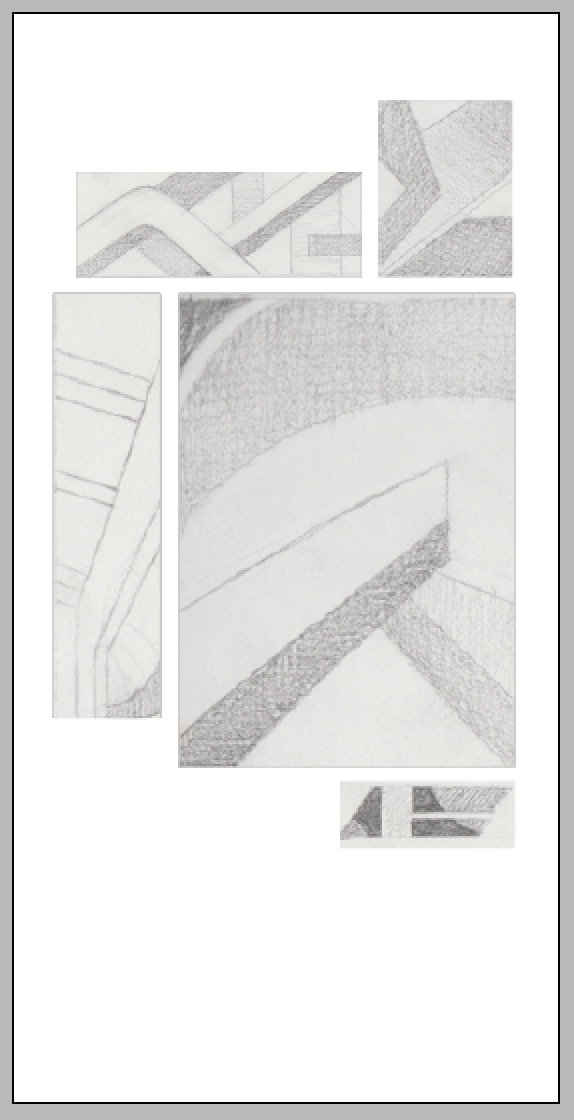
Using a collection of old photos and some new ones taken with this brief in mind, I was able to create tonal drawings to inform the larger paintings.
I scaled down the measurements of my chosen canvas' and transferred some of these photo sketches on to these formats. I was then able to cut out and move around to come up with the best composition for them to sit on the partition in the exhibition.
InDesign mock ups to scale on size of partition - the partition my work will be displayed on is 4ft wide by 8ft tall, so I'm preparing the composition around this, before I begin working on the pieces.
I tested some compositions with the physical pieces as well.
Although overlapping the pieces works visually, I don't want to cover up any part of the paintings and it may make it harder to hang them on board.
Using the definition of a 'disposable society' I've taken parts of this text to use as the writing for my paintings. With more time I had planned to research more thoroughly in to waste and re using materials in a consumerist society, however with less than 2 weeks on this project I decided to use text already available to me that defines it literally.

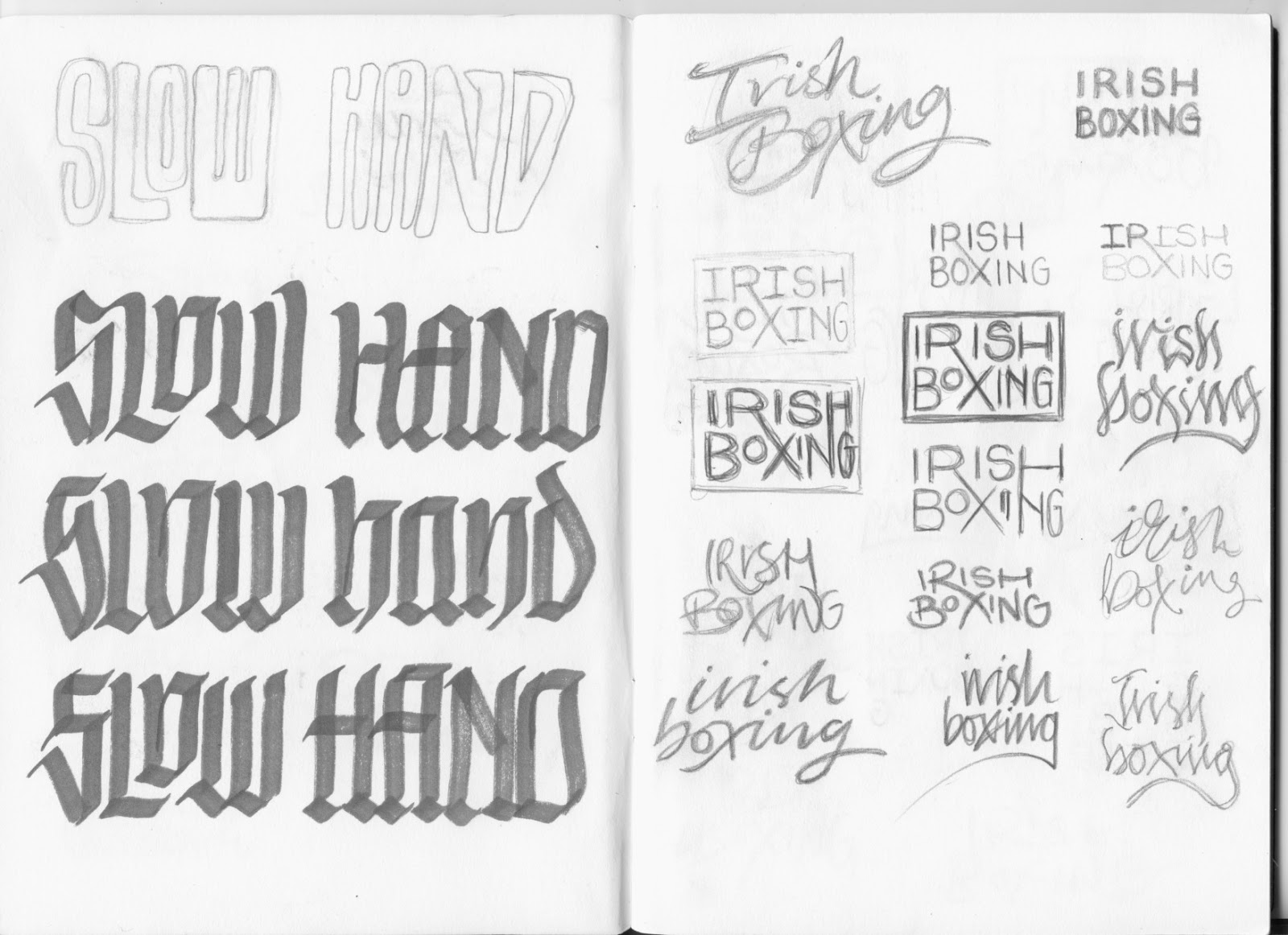
I've experimented with a variety of different calligraphic styles, trying to revive them in a modern context and use the art of writing to highlight the disposable nature of calligraphy in a digital world where the handwriting becomes unnecessary for those who work with and own using computers.
I have done some tests to scale of the designs I want to put on the final pieces so I can get an idea of what they look like and develop them further if necessary.
Final pieces
Working from the sketches I decided what needed changing and began painting on the canvas'. In the image below it became obvious that the white centre lettering needed to be smaller and the textures were too busy, which led me to block out more colour on the final design.
The black/ dark purple paint worked really well on the silky varnished wooden piece, appearing as textured surface and working well as a background.
Largest piece;
Which way round works better?
I wasn't happy with this design and couldn't make it work after changing several aspects. I ended up scrapping this design entirely and went back to the drawing board to create a more balanced composition.
Finals completed


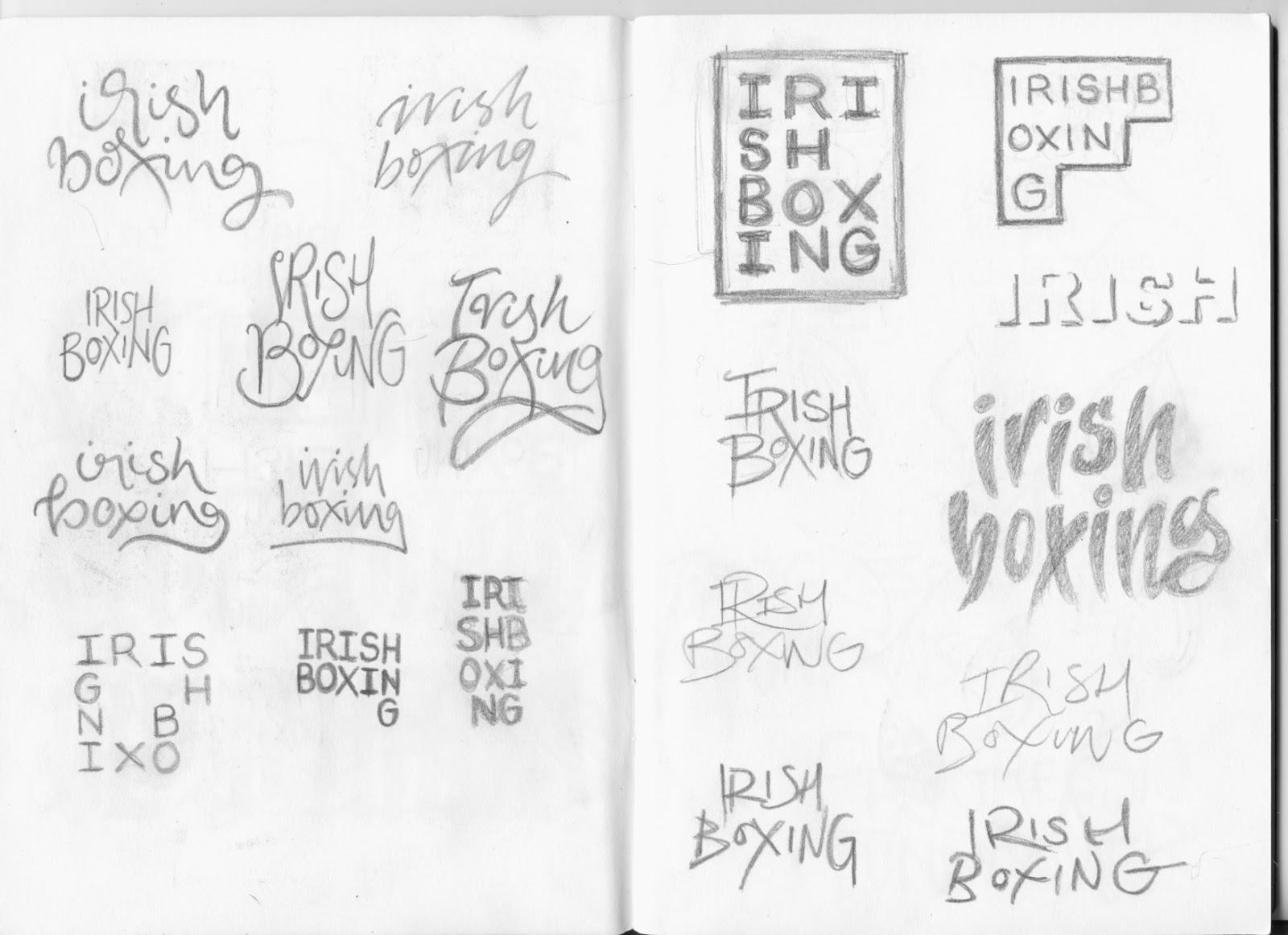


 I've experimented with a variety of different calligraphic styles, trying to revive them in a modern context and use the art of writing to highlight the disposable nature of calligraphy in a digital world where the handwriting becomes unnecessary for those who work with and own using computers.


