Online Promotion
Following our guerrilla advertising, we have been posting images of some stencil designs on our Instagram account in their location. As a lot of them will be removed very soon after doing them, documenting them photographically is the best way to keep the impermanent advertising in a permanent format. From this, we have encouraged people to spot our stencil marks and post an image tagging us in it so it can reach a wider audience.


We plan to continue with this extensively over the next two weeks.
Another way we plan to promote the event online, and give people more incentive to post photos of these pieces, is to create an online competition. One idea is that everyone who posts an image of one of the stencil designs will be entered into a draw to win a publication containing all the pieces in the exhibition and a bit about the creators of each piece.
Poster development
Collaborating with our photographer, Karl who studies BA Photography at LCA, we got some good photos of the white objects and with some minor editing we achieved a pure white result as intended. We had some different versions taken, some close up and with different compositional arrangements to make sure we got the right image to use for the posters. Here are some of the versions:


I originally imagined the poster using the image of the complete objects as a small pile of rubbish, with space around them. However some of the cropped versions work well as a dynamic composition and show the objects in more detail, which makes it more obvious what they actually are.
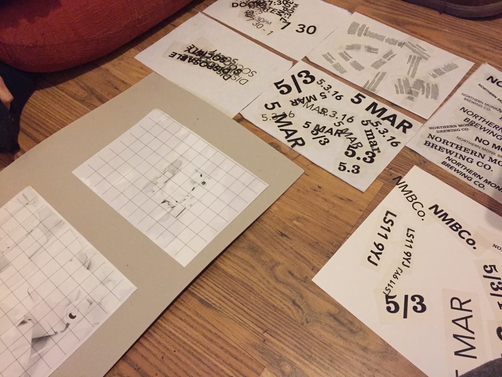
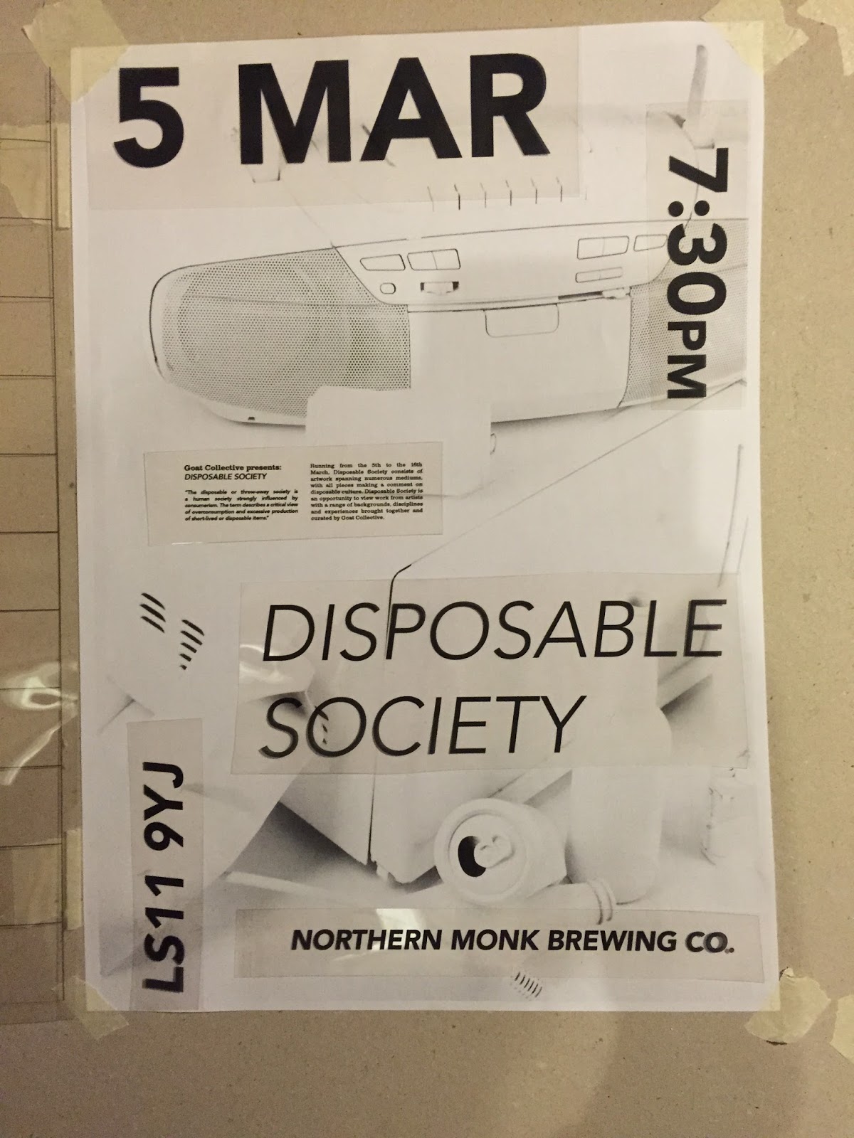
To experiment with placement of text me and Dan took it upon ourselves to do some physical tests using different sizes and styles of the relevant information. We need to include the date, time, place, and a brief description of the exhibition.
We printed different sections of text on to acetate, playing with columns, widths, and sizes of each element to try and achieve the best result by testing them on A4 print outs of the images we are using.


We spoke about producing A1 posters using just the striking white image of all the objects, with a QR code for people to get the information. This would be the only clue on the poster which would give away any information, which would intrigue the audience to scan the code sending them to a link of the full poster with text. This element of interaction would engage them and be more memorable than seeing a poster that is the same as every other.. one that actually gives you information as their main purpose as adverts.
Although this is a valid idea, we cannot be certain that everyone would download the app to scan the QR code, so would only be beneficial as an extra. We would still need to produce other posters containing all the necessary information, and smaller, A5 or A6 flyers would be a good idea to place in small shops for people to take. We could also look in to handing them out in certain places, although I think we will get enough exposure from placing them in shops and cafes/bars that attract a similar audience to those we are targeting to come to the exhibition.
From the initial layout experiments, we took it to the computer to refine and create digitally. This way we could see what the text looks like in colour as well. This took a few attempts to come up with a layout we both liked which we then took to the rest of Goat Collective to ask for final feedback and opinions.
(images SS)
GIFs and online posters
An idea we had when doing the white object photoshoot was to create a GIF, which would introduce a moving element to the promotions, something that I consider a vital part of promotion as it can engage the audience more than a still image. This will work well online as it's the only place it can be seen, and we can promote this through social media. By giving people the information in a small space of time, they are more likely to engage with it - especially in a quick fire video/gif - if it is less effort for them to withdraw the information they need.

After several alterations, we made the GIF square format to apply to social media, particularly Instagram, and used what has become our brand colour, red, to contrast the stark white. We realised that on the previous GIF we were primarily looking at the text rather than the image, which took away the effect of the appearing objects.


No comments:
Post a Comment