Following a meeting with photographer Anne Wyman, where we discussed ideas for her branding and logo, I began sketching and researching into minimal geometric typefaces and logo designs.
This is her website at the moment, with a sans serif typeface used for her name. I don't want to stray too far from this as I think it works perfectly as a minimal aesthetic and I want to capitalise on the multiple diagonals and angles in the letters of her name.
It suits her style of photography and refers to the angles and lines present in her photographs, often made by shadows and architecture. Her visual interests also include a lot of geometry, so this is something I could work in to her branding as pattern.
Some outcomes requested by client;
- Business Cards
- Logo
- Letter Heading
- Website
Research
Looking at existing photographers' branding which is minimal, especially within web design as it's clear that Anne is using this online platform to showcase most of her work.
Experiments
I decided sketches weren't the best way to move forward with this as I plan on using a typeface and altering it slightly to create the end result.
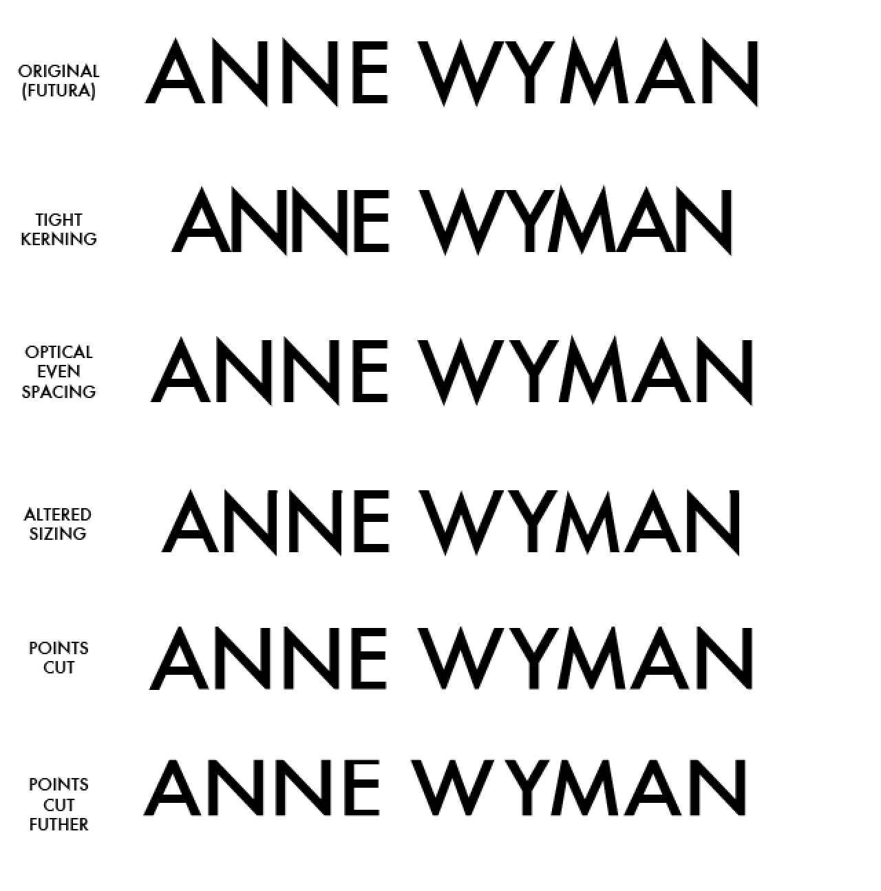
Futura; a geometric typeface with sharp angles and a clean aesthetic. I played around with the kerning and tracking, as well as altering the sizes of certain letters and cropping letterforms to a level baseline and cap height.
The altered sizing and cut off points work best, and after experimenting with lowercase as well I've begun to turn against Futura as a suitable typeface.
I found that futura wasn't working as well as I'd hoped and the overhanging sharp points on the diagonals just looked weird. Lowercase didn't work any better, as this diminishes the concept and nice aesthetic of the uppercase forms of the letters in her name. I started scanning the internet for geometric sans serifs that I could use instead, and downloaded a couple to experiment with.
Raleway & Novecento Sans;
These faces worked better and I particularly like the W in Raleway. Novecento sans is also a really nice minimal typeface, which makes her name look balanced and evenly spaced. However I want to make her logo/wordmark more interesting than just using a typeface, so started playing with the diagonals in her name, removing crtain parts to try and get a unique alteration for the logo.
Business cards;
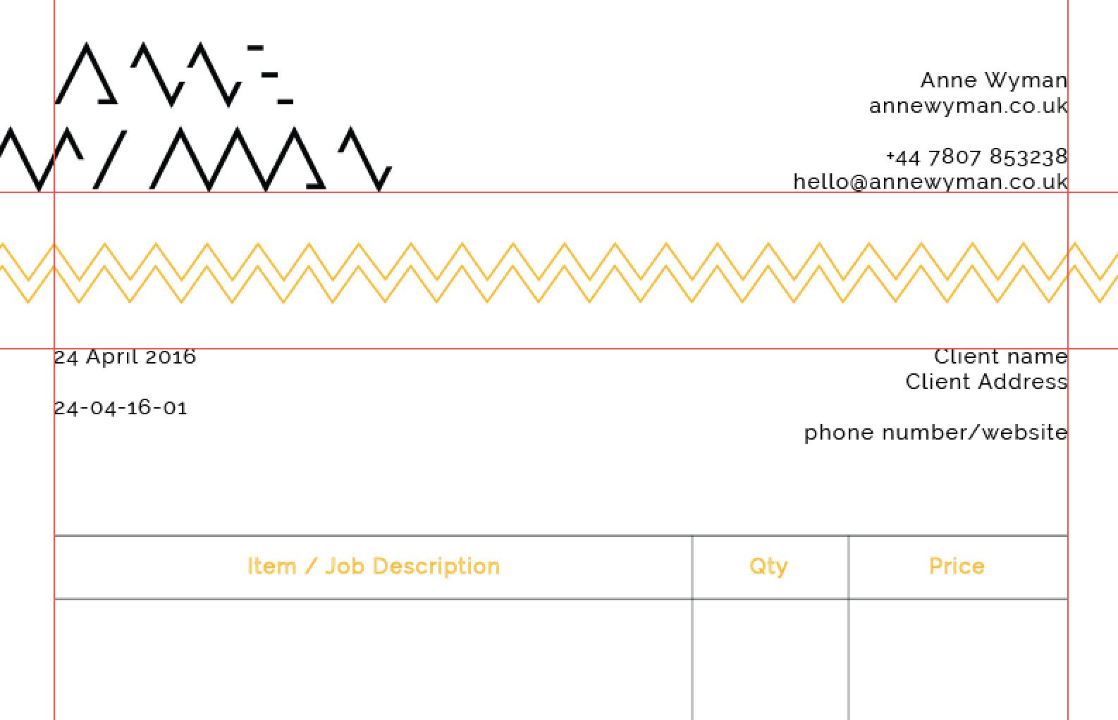
Anne recently got a sample set of business cards from Moo which is where she plans to get them printed. I had a look through so I can relate this to the design, and one which struck my attention was an embossed zigzag design on one side of the card, adding a tactile element.
Design based on zig zag pattern - utilising the diagonal lines and angles in ANNE WYMAN
I tried creating a monogram using the same concept of the whole logo but it didn't work that well so I've decided to just stick to the word mark as the only logo design.
Experiments with pattern and business card design
Colour scheme
Uploading designs to Moo
Development of brand identity
Website design
Although Anne has already got a host website with her own domain, I mocked up some examples of how to improve on this design by changing spacing, logo at the top and added extras such as colour change of links when hovered over. I also cleaned up the about page, aligning the information into a hierarchy that provides info about Anne first with links to contact on the right. Anne was able to send her coder the screenshots and from this he changed it accordingly.

Her website is now live and my design has been applied to it.
Finals