Work with the colour you have been assigned and make it work like any other brief.
(for ordering and labelling processes no swapping - based on time and not everyone being here we need to stick to the list below)
Size 27.9 x 27.9 - A3 square exactly. 175 gsm
(there can be layering but prints need to be flat enough to sit under a frame)
If you are working with an edition, it needs to be an edition or as much as the process will allow
(it is up to you whether you make an edition - all you need it one amazing print)
MOST IMPORTANTLY this is process lead, the theme is print and process. It is all process lead. Process lead.
P-R-O-C-E-S-S.
Check out the GFSmith Heritage Collection and watch their short films on the making process behind their dyes, paper etc... this really explains their values and approach. Also, their take on process and material lead means to them - which you need to reflect.Brief: Create a print on selected colour Mandarin to be displayed at Leeds Print Festival amongst a spectrum of colourful prints created by classmates.
I was given Mandarin as my coloured stock to work with, so my initial research began looking at suitable colours to print on or use within my design.
Mandarin
Initial ideas and sketches: Using circle design to fit within square format
Experiments with three interlocking squares to represent the three established business/companies.
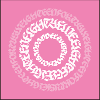
I thought about cutting out sections to reveal a layer beneath the GFSmith stock but this doesn't fit with the brief so I've decided against it. The three asymmetric circles didn't seem to work that well without being in three separate areas of the square, so decided completely central circles would be a better design.
I tested writing the full date out in a few different styles to see which worked best visually, and at what sizes.
Digital experiments with colour
Once I'd worked out the final design and scanned in to alter the sizes and arrangement, I started working with colour. The best way for me to experiment with colour is to mock the design up digitally on Photoshop. This allows me to change colour while maintaining tone, or completely changing the hues using a fill tool to get an idea of which colours work against Mandarin.


Blues and greens of this tone (below) contrast too little with the orange and have too similar values, making it uneasy on the eye and slightly difficult to read (or even look at).
After asking for opinions from several other designers I decided a navy and mint green would work well against the orange, complimentary though not too obviously complete opposites. The darker tone of the blue and yellow-white green have different values from the strong, saturated orange so the lack of similarity makes it more visually appealing.
Printing
I set up all three positives on one screen but stupidly made the mistake of not using registration marks or marking on with tape where the centre point was.. Fortunately I was able to guess though it did slow down the process, meaning the ink sometimes dried and it was a lot more effort that it needed to be. To add further printing techniques I experimented with the foil blocking, something I've wanted to do for a while but haven't got round to. The inner circle seemed most appropriate to foil block, separating the ink layers either side and it also has the largest surface area which means the foil is more likely to stick well.
After screen printing the middle section with glue, I used the heat press to secure the metallic foil before peeling off to reveal the design.
Leeds Print Festival


No comments:
Post a Comment