My final leaflet design has been digitally printed on white stock which I then scored and folded accordingly. To make sure the leaflet worked when folded up completely, I made sure the pieces descended in width from the outside piece to the inner page that is last to unfold.
After un-doing the white, fastening rectangle which slips in between the two triangular purple pieces, the leaflet unfolds step-by-step, first showing the main heading of the leaflet: A design process.


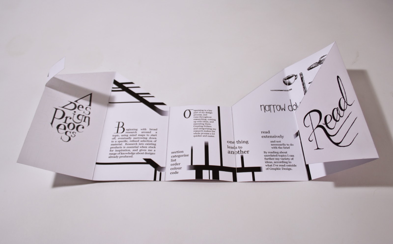

Complete reverse side of leaflet:


It can be stood up in many different ways due to its one-direction fold, and the irregularly cut angular aesthetic provides different standing arrangements. The choice of stock is fitting for this reason, as well as pure white being the most suitable colour to fit with the entirely black and white inside.
The 4 stages of my design process include; research, organise, read, and draw. The back cover when folded up flat outlines all four titles (literally), and is essentially a summary of the stages the leaflet contains. A potential logo for my own brand appears on the front when it's fastened together, relating the leaflet back to my personal method of design.
Unfolding each section step by step reveals the next level of my design process, with black and white graphics on the inside depicting the journey I go through, with strands coming off to show exploration and persistence within each stage. This monochrome spread contrasts with the opposing, colourful side which is primarily made up of the hand drawn titles I made, reinforcing the drawing element of the design process. The gradient of purple tints also demonstrates the journey as the leaflet unfolds, getting a shade lighter until the lightest (white) inside is fully visible.
I chose a serif font (Georgia) for the printed body copy, as I feel that when printed, it's qualities are more formal in comparison with the hand drawn elements, even on the inside spread. However, I'd like to change the positioning and width of some of the text pieces so that overall the text to negative space ratio is more balanced throughout. The partially random alignment and positioning of text hints at how I jump about doing different things along the way to get to the final outcome.
Improvements
When printed, I could see some gaps between each fold where the coloured panels weren't lined up properly on InDesign. Ideally, it would be better and more professional if the shape was die cut to ensure accuracy, however this printing process is a lot more expensive and is cheaper and easier to cut out by hand, unless I was producing a large amount. It wouldn't be practical to die cut just one publication. I would also make the gradients more gradual and possibly make the illustrations inside a dark shade of grey so they're not too overpowering against white, which I think the black strips may be. I'd also change the paragraphs to make them more unified, i.e. one or two widths max throughout content, creating more even space between and making them less cramped against graphic elements.
Another improvement would be to make the front of the leaflet, when folded up, more appealing and informative as to what the content is about. The fastening strip should also be more clear that this is how you begin to unfold - although I added the small arrow to indicate this, it still may not be obvious.
No comments:
Post a Comment