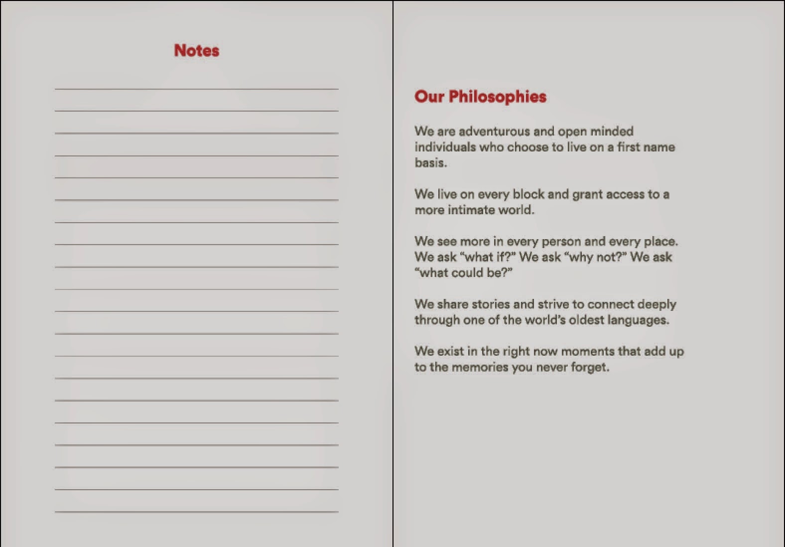
AirBnB's mission statement is in a large point size on the inside of the front cover, opposite the ID card which is the first page. This placement informs people straight away what the aim of AirBnB is, and gives you information about the person they've just met. We added an extra spread at the back of the passport with a page for notes using the same structure of lines that are used on the illustration spreads. AirBnB's philosophies - five of their aims - cover the second to last page of the passport which reinforces the connection with the brand. On the last page is a QR code to encourage people to connect with Maurice (example) through his AirBnB profile.


Using the vinyl cutter we were able to create several different Belos and print them on to transparent paper so that when each one is stuck down, the illustrations will be seen through. We cut them into circles which maintains continuity through all aspects of the design. We also designed the net and made the pocket to fit in the back which will contain the pack of stickers.


We received the publications back from Pressision, and unfortunately the textured stock we had asked for on the cover hadn't been used. It was still a thick stock but we all agreed it would have looked better with the textured Morocco stock. The gloss lamination covering the ID card and QR code page creates a more official aesthetic which is what we hoped for. The embossed logo on the front cover added a tactile value to the document, however out of the ten booklets we had printed quite a few of them were offset from the white area which was disappointing. It also would have looked better if the emboss was raised more making it more apparent, but the texture can still be detected through touch.


The pure white stock for the inside pages was definitely a good choice as it fits with the white used on the brand logo and doesn't distract or alter the perception of colour use, which is a key part of the design. We used a grey stock similar to the one AirBnB use to hand make the pocket for the individual's stickers, which fits on the back page leaving the rausch colour visible as a border, coinciding with the borders throughout the passport. In the end we had the passports staple bound to lower the cost while still achieving a neat finish, although saddle stitching the pages together would have been a much better binding technique.
I'm really happy with the final outcome and have enjoyed working with Dan and Mo on this brief. It's definitely shown me what working collaboratively can achieve, and in the time frame we had I think we have produced a well informed and professional campaign to empower the AirBnB community.
No comments:
Post a Comment