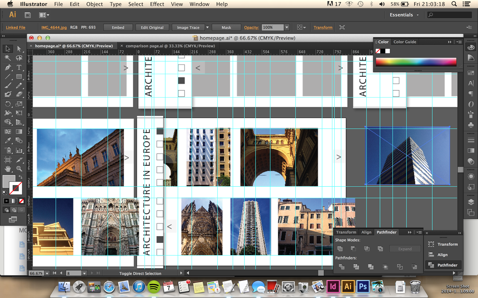
After developing and planning out my idea through sketches I mocked it up on Illustrator so I could get a better idea of what it would look like as a website. I used basic shapes in different tones to show different objects.


Different actions on the homepage:
- general layout
- hover over heading reveals about/info
- click to push back sidebar
- switch to 2 comparison view
- push back to reveal more photos on stream (click heading)
The sidebar can be pushed back to reveal a wider view of the photos by clicking the heading. Clicking again with show the sidebar.
The heading of the topic 'Architecture in Europe' is rotated and covers the left hand side of the site. It's fixed there except for the 2 comparison view page which can only be changed from by converting back to the homepage using the same button.
On the right hand side there's a transparent icon that appears when the cursor enters that box area. This takes you to a separate viewing page - two photo comparison.

To control the photo stream on the homepage, different cities can be selected so that only photos from that city are shown on that horizontal bar. This allows photos from two different cities in Europe to be compared at the same time. Right and left navigation tools appear on each stream (also works by scrolling). When the user hovers over the boxes, the name of city is shown stretching from the box, and box outline fades to lighter grey. When selected, the box fills dark grey and name disappears.
When sidebar is pushed back and squares are hovered over/selected, the names are not shown. Heading has to be hovered over first to reveal wider navigation bar - only then will names appear from boxes
_______________________
A different way of viewing and comparing the photos shows the page divided into two with separate navigation squares across the bottom of each side. Similarly to the homepage, clicking on each square means only photos from that city will be shown when clicking right and left buttons at either side of the heading (name of the city). This view shows the photos at a much larger size than the homepage and allows users to compare individual photographs of certain buildings.


The icon to switch between this view and the main homepage view stays at the right hand side in both cases, and are simple icons that represent the core structure of each view - one with a vertical line down the centre and the other split into three sections. The two sides work completely apart from one another which allows the user to select one photo on one side, and then compare with a chosen photo on the other side.
Other features on this view include the navigation squares from left to right at the top of both sides, and a short information box about each photograph or city - not sure of the exact information to include yet. When any part the image is hovered over, a dark grey, low opacity box slides up from the bottom of the page revealing the text which is in white to contrast with the darker background
The split screen feature and sliding transitions is symbolic of the frames in a roll of film and continues the horizontal viewing stream, easing into the next photo. Photos from one place will be on a continuous loop and in the same order every time that city is chosen to avoid confusion and make navigation more efficient for returning users.
When creating this page I realised it would be useful to have another section, 'all', which would include every photo from all cities. This way the page can still be used to compare photos in a random order if the user doesn't know which city / doesn't have a preference to look at any in particular.
Began mocking photos into the document so I could get a better feel of what it would look like with actual content. I also added a drop shadow to the side bar so it looks like the photos are going behind it, implying that the photos continue further or are on a loop/reel.

The photos are all reduced in size to fit within the bounding lines of the two horizontal rows, and the square of selected city stays dark grey colour.
To include the option for viewing a random order of photos from all cities, I've decided 6 options (squares) would be better and will be of a smaller size.
Another change I'm going to make is to have a list of links instead of about/info text on the dark translucent box in the side bar, revealed when the title is clicked. This list will include links to other pages including an archive, contact page, and an information page.
No comments:
Post a Comment