I had a few ideas for methods of advertising my website, in the form of a poster, business cards, a zine, a photo comparison booklet, and a magazine ad.


I started to finalise these ideas more and more, with some feedback from my peers I also came up with a small folded leaflet which would show only a section of a full photograph, picking up on the shape and form of the architecture in a small section. Below are my initial sketches for this, (right hand page), which show my experiments with the sizing; how wide the border should be to include text and be held with a finger and thumb without covering the images in the centre.
______________________
Chosen designs
Initially I planned to have the centre images printed on acetate, so when the card was held up to buildings in daylight the light would shine through and you would be able to compare it to the architecture you could see in front of you.


Above shows my to-scale drawings of the small card, in top left the size I had planned - 85 x 55 mm (business/credit card). After drawing this out I realised that with a 20mm border to allow for holding space, the area for the images was ridiculously small, and even with a 1cm border it would not leave enough room. The bottom right is the final size I plan to print (see sketchbook) with 85 x 55mm as the inner section and a 10mm border. The aesthetics of the card will follow on from the design of the webpage, using the same fonts and spacing to highlight different parts of the text. Website name is smaller on both short ends.
I've also decided to print the cards without acetate, and cut away one section of the angular shapes instead so the user can view architecture in the city they're in clearly next to sections of three other photographs from a particular city in Europe. These could be given out easily and are convenient for people to pocket or slip in their wallet or purse. Ideally they would be best to have laser cut, or die cut if they were to be produced in bulk.
The second print advertisement I plan to produce will be an A5 flyer-style card when folded out, but will be given out in an A6 format folded down the centre. The front will be blank with an angular cut out showing through to a part of the photograph on the inside. I've drawn out two versions of this ad, one showing a portrait photograph and one a landscape, varying the layout so it represents the different orientation of the homepage and comparison page (homepage photo comparisons are split horizontally, whereas the single photo page is split vertically down the centre).

The third print advert is a poster, made up of six landscape photo slots that act as frames, holding photo cards with a photograph and the name of the city underneath which becomes visible along with the photo when it slides into place. An alternative version of the poster would be landscape orientated and include six portrait photos (six to reflect the number of cities available to choose from currently on the website).

Working out how the printed pieces would fit together before creating the designs digitally:

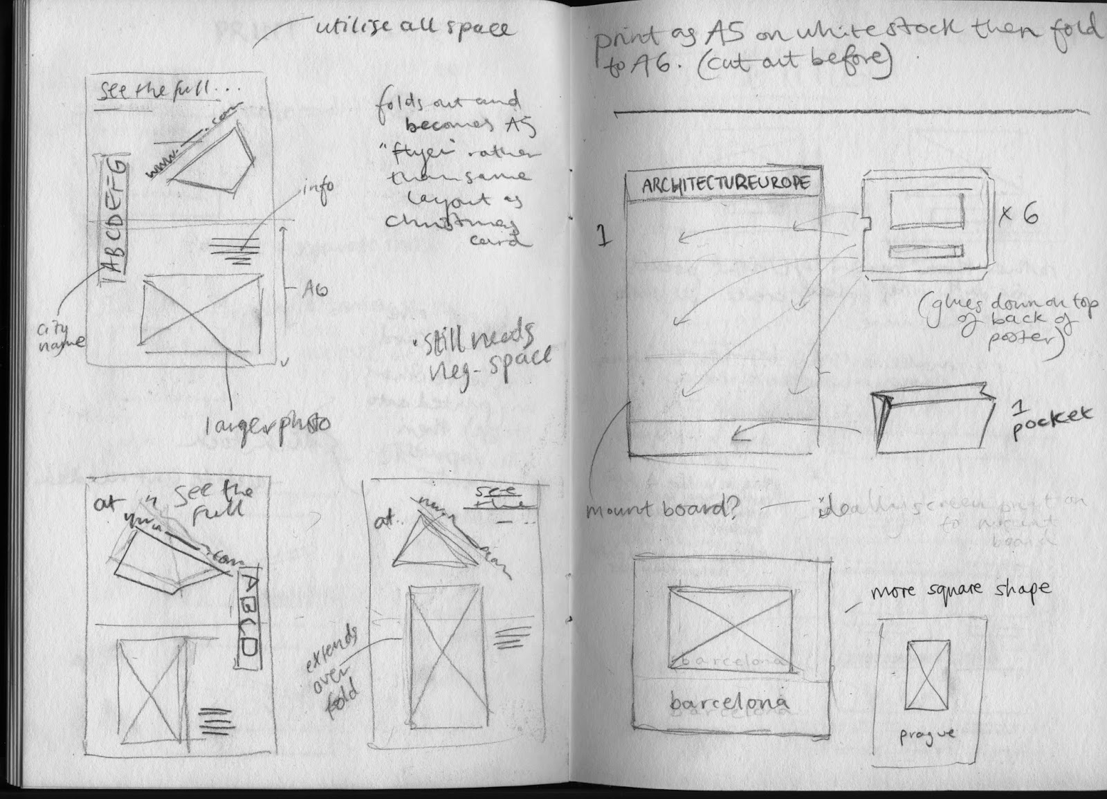


After sorting out nets for the pockets on the poster I thought about other information to include, such as the title of the project and URL.

After a few experiments on Illustrator mocking up the designs to size I was unsure of the layout so returned to sketches to try out a few different compositions.

No comments:
Post a Comment