I experimented with several ideas based on the idea of using type or lettering in my designs, including using ascenders and descenders to create the linked up appearance, similarly structured letterforms to create pattern, and a separate idea of using the natural flow of material on something more rigid and flat.
With the brief stating that they want to sell 'art on your walls' rather than standard wallpaper designs, I want to incorporate the natural and organic elements of hand rendered material in the final piece.
Design 1 - Lettering Pattern
I developed the hand drawn pattern on Illustrator making sure that each ascender and descender matched up evenly to create a continuous design. I felt that this worked best in a singular, thin stroke, keeping the uneven flow and natural errors of my own handwriting to draw attention to the fact it has been produced by hand. To keep some structure in the design I used loose construction lines and considered the spacing of letterforms between the ascender/descenders (e.g. a 'w' takes up far more space than an 'i').


Design 2 - Type
Going back to one of my initial ideas for type as pattern, I've started to put together the 'AA' design I created which is intended to be seen as type close up, but at a distance as pattern and gradient. I considered using A and V as the mirrored appearance of these in uppercase form which is what gave me the initial idea, using the naturally opposing forms. If I take this idea further I intend to create a design with more depth, possibly using different shades or colours to produce a more interesting aesthetic.


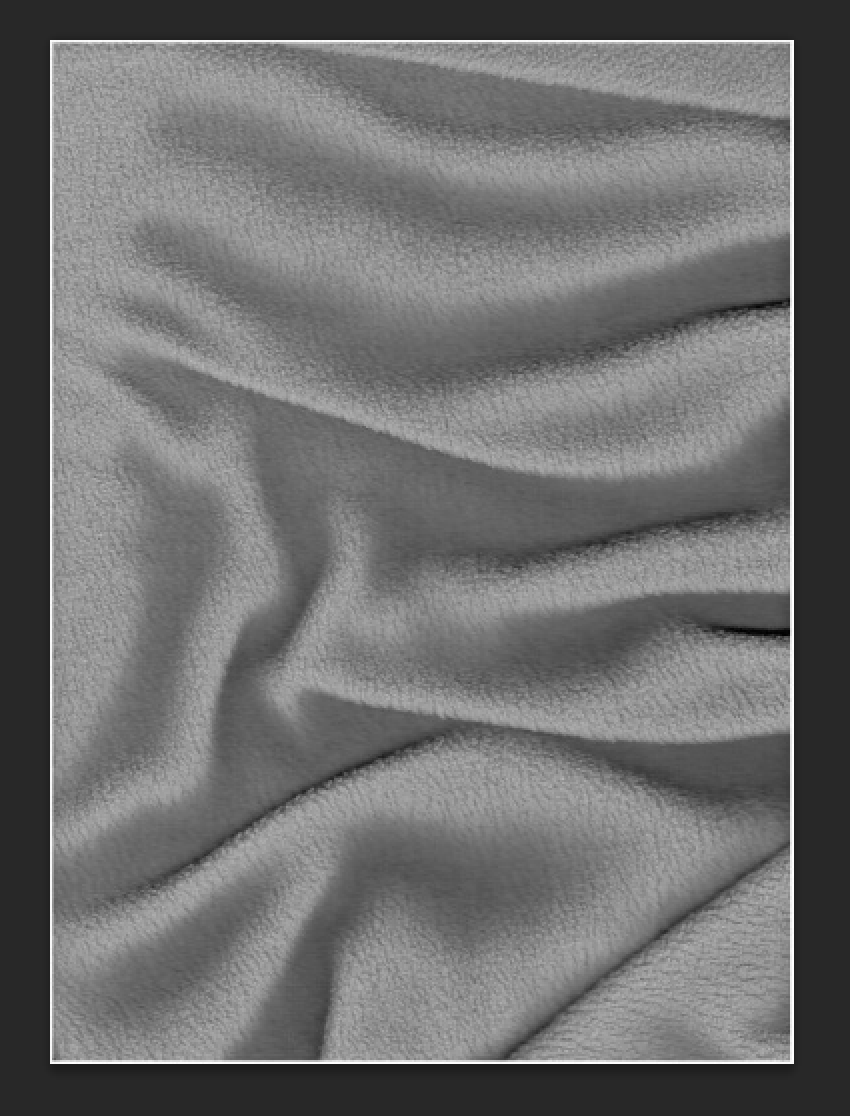
Design 3 - Fabric
Another, separate idea I had was to scan scrunched up fabric and create a half tone image to suggest depth on the wall, advocating the idea of having real material on the walls with physical qualities. Taken from a scan, however, this photographic image would have to be made into half tone for printing. From different distances to the wall, the design would appear more like fabric from further away, and close up the viewer would be able to see the detail of the individual dots. This idea works on the idea of seeing the whole image when taking a step back compared with being blinded to certain aspects when viewing something from only one angle. I also like how this plays with the idea of wallpaper only being flat; by using differences in tone and shade the darker areas are pushed back and the flowing creases of the fabric appear to make the wallpaper seem like material rather than flat paper.


I wasn't satisfied with any of these ideas, and have recently been experimenting with calligraphy and hand lettering, particularly black letter style characters, so decided to incorporate this into my work. After playing around with some wide nibbed calligraphy pens I decided on a pattern I created inspired by blackletter style typefaces.


From these initial experiments I began to devise a pattern based on the stems and connections of black letter characteristics. My aim was to create a design that incorporated these elements in a way that made them fit within the negative space of other characters.


Once I had scanned, traced, and re drawn some of the letterforms to make the design more varied and proportioned, I neatened up each character on Illustrator using the direct selection tool to adjust certain anchor points to achieve the desired effect. Through this I was able to straighten up any wonky vertical lines and ensure that spacing between each character matched across the whole page.


I uploaded a preview to the Feathr site to see how well the design matched up and how much I needed to change so it worked as a repeat pattern. It didn't match up very well so I used a trial and error process to make it continue seamlessly.


This process took quite a while but eventually my design matched up perfectly.


Colour experiments
After creating in black and white I tried out a few contrasting colour choices to test out the design for different purposes; some with light text on a darker background, though I think it works best with dark lettering on a lighter background.


I asked for the opinions of several classmates to decide which versions to upload, and eventually chose three to upload; purple, greys, and white on grey. These colours are more appropriate for wallpaper designs as they aren't too heavy on the eyes which had to be considered due to the large amount of block shapes in close proximity to each other. I felt that the black and white design was too contrasting, and for some people may make the letterforms blur and merge into a uneasy mess.
No comments:
Post a Comment