

From this I had the idea to produce typographic solutions specific to each series of photos. I felt that for the Berlin zine, although not many of the photographs include this part of the capital's culture, graffiti or hand drawn tag style would be most suitable. Initially I had planned to keep the structure of the title for this booklet very formal and precise, due to the nature of Germany's efficiency, shown in my experiments with 'In Berlin', the title I chose.


________________________________________


Following my change in direction for the style of typography for this cover, I began to experiment with hand styles which required a lot more practice and tests until I produced a result I was happy with. I looked at some existing graffiti work on Pinterest to gather research and observe, as this is a style that I am unfamiliar with compared to other lettering techniques. What attracted me was the raw, simple shapes that create unusual letterform styles, though a lot of hand styling is far more complex than most tags. Although this is a style I am not confident with, I feel that I have explored the variations widely enough to reach my solution.


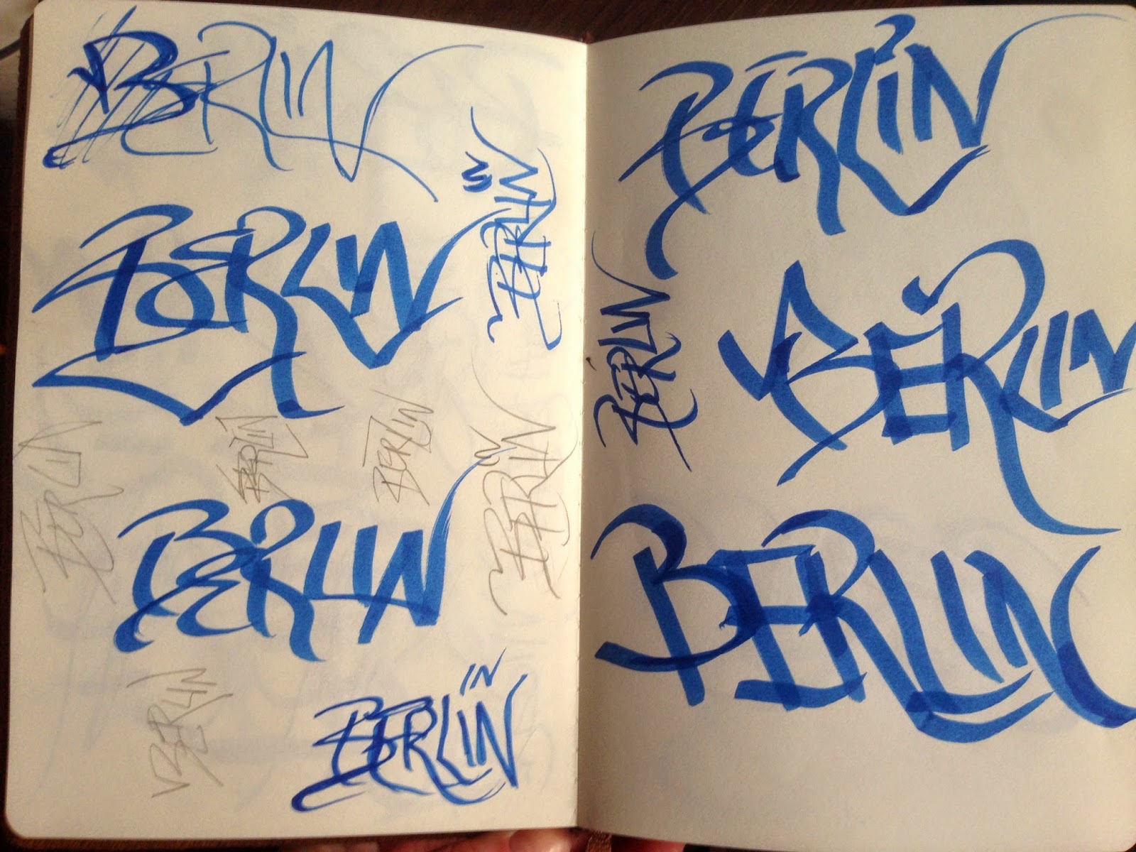


This design was the most difficult as it is a style of lettering I'm not confident with at all. I feel that through these experiments I have explored many different compositions and furthered my exploration in different lettering styles.
Once I was happy with what I had produced - including dotting the 'i' with 'IN' as a way of bringing together both words in a unified design - I scanned and transferred this to Illustrator where I could easily live trace the image due to the high contrast. It even picked up on the areas where the pen stroke wasn't completely filled which I kept due to its natural, organic essence that hand drawing the title creates.


Amsterdam
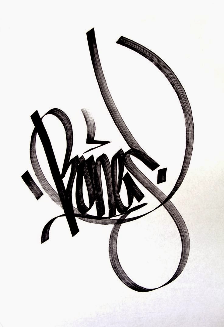
I began drawing the illustrations for the Amsterdam cover by referring to the semi-circular design of its infamous canals, curving round in a repeated fashion. However, I opted for a continuous line in the end as it reminded me of walking round the streets and canals of Amsterdam as if they were never ending, often ending up walking back on myself or in circles covering the same or similar paths. This continuous line hints at the characters that spell the city name, though I tried a few variations to perfect the design.


I edited the contrast and cleaning up the image before live tracing to achieve a clean result.

No comments:
Post a Comment