Deadline: 14th April
Research;
Looked at previous artwork from book one and two to get some ideas and see what kind of designs they are after.
Sketches & development;
I took ideas from articles I've been reading and didn't think to much about the content, rather than the style and the overall design. I wanted to incorporate blackletter calligraphy and something pencil drawn, such as script lettering.
Digital alterations;
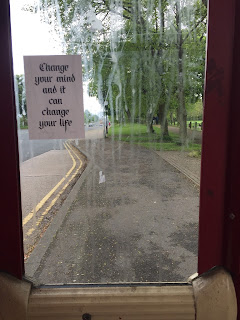
I was able to scan the original drawings and alter them digitally, rubbing out marks on the page and neatening up areas of the lettering. I wanted to keep the tone in the 'change your mind' design, and also kept the rough sketch marks and outline in 'mind' rather than filling it in and creating a vector image. I decided to take these two designs forward as they were my strongest and have a common theme.
Final designs;
Both designs had to be in black and white to comply with the rules of the competition. I created two to submit, each with opposite colour inverts.
Application to real world as well as submission for book;
Extending the brief, I printed stickers and glossy A6 prints of each design to leave as free art drops in cafés, bars and on the streets. This also allowed me to print the designs at actual size (if they're to be chosen for the book) and at a larger scale as possible prints to sell. This is something that I could consider as a commercial artist.


No comments:
Post a Comment