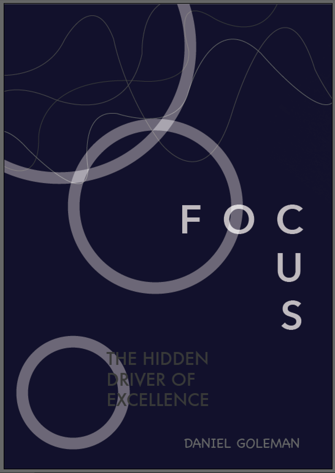
I have chosen to redesign Daniel Goleman's Focus: The Hidden Driver of Excellence, where he talks about the inner, outer and other focus and how we can manage our distractions to become more focused. Existing covers:


Research
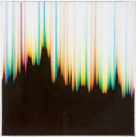
Initially I looked into the obvious connotations of focus, and how this has been represented visually. I found some interesting images that confirmed my ideas of a trippy/illusion type graphic, though I didn't want the design to be an obvious interpretation.
I also like the idea of using half tone dots to bring something into focus at a further distance, and when viewed closer it becomes less of a full image and more obscure.


I also looked into the information included on the back of the book cover and a bit about the book itself. This was mainly to get the dimensions to create the book cover and some reviews to include on the back.

Sketches and Development


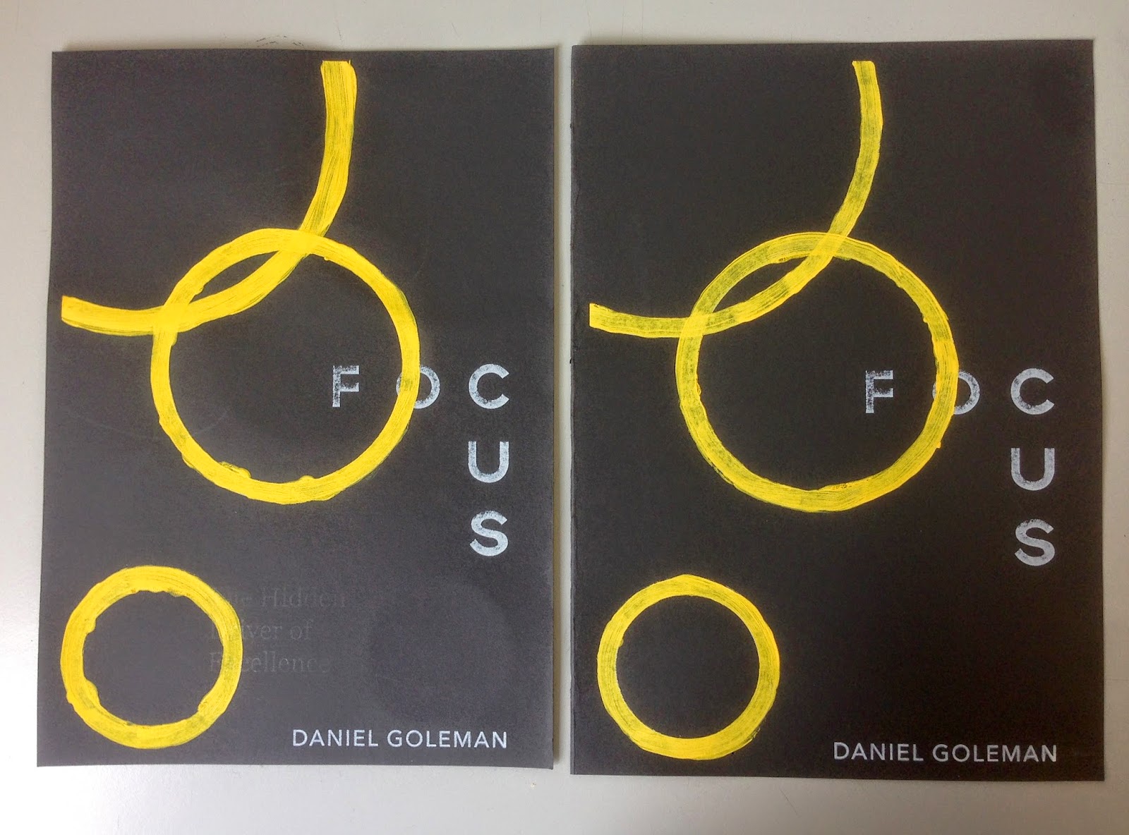
Once I had decided on the main visuals, using circles as a shape to play with in the title as well. The O, C and U were altered to appear more circular to fit with the overall aesthetic. Playing around with the composition proved to allow multiple possibilities for the layout of each element, and gave me leeway to position the text in several different ways, drawing focus to parts of the page in a certain order.
Digital
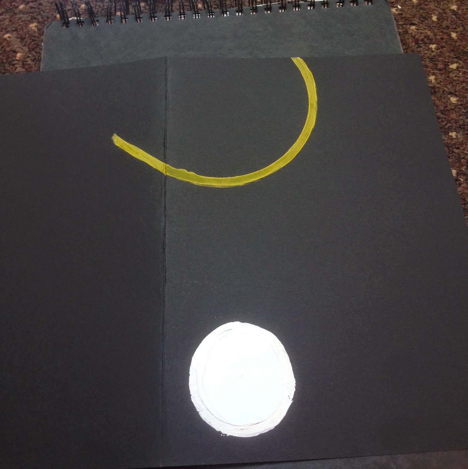
I experimented with paint for the yellow circles as I felt a more hands on approach to producing the visuals was relevant to the orientation of subject around the individual, as the book talks about how to take control of your distractions in order to achieve more within yourself. So far I have kept the type to a minimum with a clean aesthetic, only including the title, subtitle and author's name in a sans serif face. Changes in composition and weight of typeface bring focus to different areas of the cover, which is something I need to consider more to ensure the eye follows the page in an engaging way.


Messed around with the type to reflect the focus on a camera, keeping the centre point 'in focus' and other letterforms slightly offset symbolising slightly blurry visuals created when the lens isn't quite as sharp as it could be. This developed to centre around the O in FOCUS, which reinforces the circular shape I've used to represent the three areas of focus.


After my initial experiments I decided to use the golden ratio to inform the size of the circles so naturally they would appear more in sync with each other, increasing in size by 1:1.6 each time.


played around with different waves using pen tool until I found a rising composition that would flow across the front and back of the book cover sleeve.
Feedback that typeface doesn't quite sit right - traced over and hand rendered aspects to make the three corner letterforms more circular to reflect the three yellow circles symbolic of inner, outer and other focus.


Above are the final digital versions, with the grid visible on the left. The type is more more suited to the style of the cover, incorporating the circular shape across several elements. The grey waves and text is intended to be printed with clear spot varnish, keeping it just about visible and not drawing too much attention away from the main title and circles. "The hidden driver of excellence" as the subtitle is appropriately semi 'hidden' by using a clear ink to print, and the waves of distraction in the same way.
Experiments with circles from final composition on black paper, with white underneath to compare with changes in colour on different coloured surfaces. From these tests I can see that the yellow hue is more vibrant and true over the white surface, so to print on black stock as planned I will screen print the white circles before painting yellow over the top to create a similar effect. Circles are cut to size so I can easily produce consistent shapes if I were to create more than one printed poster, however for the purpose of this brief I only need one copy, so hand painting the circles is an appropriate method.

Digital finished version of book jacket


The positives for screen printing are above, split into two - one for the white ink and one for spot varnish. I have taken the brief to mean two colours doesn't include print finishes, in this case, spot varnishing. In the end the spot varnish didn't work that well, and I printed the white layer first then painted yellow circles before spot varnishing. Maybe it would work better if I used spot varnish first so the painted layer didn't raise the screen at all. Also, the spot varnish was too temperamental and dried so quickly had to wash screen 3 times before settling with a print that didn't show the effect that well. With more time I would consider exposing screen again and try to work in a cooler environment. An alternative would be to print that layer in white as well, and use yellow paint as the other colour. Next time would like to try on navy blue dark stock as well to see which worked better.
Here are four test prints, one without the yellow paint added onto the circles. I used paint to maintain hand rendered qualities that screen printing doesn't allow, also I wanted to allow some of the white to seep through or so that the yellow didn't have to be completely opaque, letting the background shine through.

On the first screen print some of the ink overflowed and caused the text to become less crisp:

I used spot varnish on two of the previous prints, though the text and lines are very faint and only show up if moved under certain lights.


My intention was to scan in the final print which would then be transferred to the book jacket design, allowing the spot varnish to be visible even on a flat image. However the spot varnish is barely visible anyway so didn't show up at all on the scan; instead I have modified the digital version to use a light grey instead of the varnished areas, breaking the rule of two colour plus stock requirements. I have kept the hand painted yellow circles, however, as I felt the handmade touch was something I couldn't subsidise.


