Sunday 30 November 2014

OUGD503 (Brief 1): Page detail and cover research

Rita Matos has produced this black and white fanzine with a coloured page insert of a smaller size, breaking up one spread with a smaller 'clip' in a sense, to provide a varied reading experience, similar to highlighting or enlarging certain quotes within an article to break up the body of text.


Smaller slip on cover - could be a separate insert that folds around the booklet with a small introduction or title page. Bureau Kayser has used this technique well with a contrast in colour complete with a small hand lettered title.  This size is large enough to retain the text but small enough to reveal enough of the image on the page beneath; only partially revealing the content.


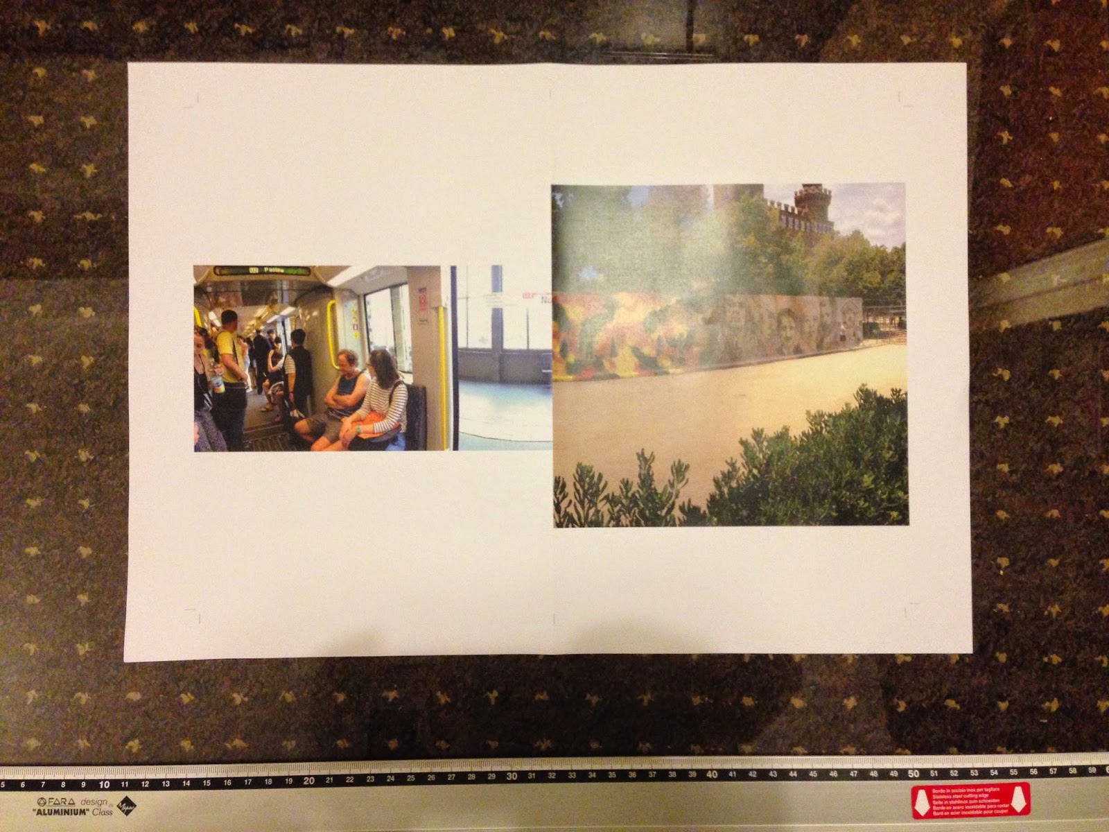
The layout below suits the soft toned photographs by including a white border and larger amounts of space around them.


Recently I've been inspired by hand painted lettering, especially clear messages made with simple brush strokes.  The raw qualities work well when the composition is balanced across the page even when each letterform isn't perfectly/rigidly spaced.


Being able to see through the textures of the marks make the designs look original, bringing out hand made qualities which reflected the tone of voice the pieces are aiming to convey.

The well executed lettering designs (e.g. below left) appeal to me far more than designs that appear to have been less thought about in terms of positioning and stroke quality (below right).  However for some briefs this style would be more a appropriate solution.  The higher contrast between the sections of each stroke in this image retain the organic feel, making each swift mark sharper and more detailed showing the exact path of movement.  In this example, the quickly constructed design is representative of the nature of pop-ups.


Rika magazine incorporates both image and loose typography on the cover.  The mix between the two brings the image to life, and frames the central photo by having the letterforms as an overlapping border and parts of each form bleeding off the edges to further accentuate the border.


RESEARCH - LETTERING

Jose Joaquin Dominguez's work appealed to me due to its raw, loose forms and texture of the marks, retaining the natural curves and movement that the hand motions created.  This brings more value to the work as it's shape reflects a more real aesthetic than if it were created with a thicker amount of ink before being digitally modified and produced.


These marks have a natural flow that draws together the hand drawn qualities in an visually structured piece.  The loose style would contrast with the straight edged photos inside my own publication and keeping only the title on the cover of the booklet using only typography.


Thursday 27 November 2014

OUGD503: Layout and print testing (panorama zine)

One idea for a photo zine consists of panoramic photos taken on my trip to Europe over summer.  The layout I've followed is quite simple, keeping the photos vertically central with a full bleed at either end so the image runs off the page at each side.  This leads each panorama onto the next one representing a journey and keeping the the format consistent.


PAGE LAYOUT


- set to B5
- 3mm bleed
- grey horizontal line continues across front and back cover, reinforcing the format of photos and continual journey throughout booklet


MOCK PRINT

Using the zine printing equipment in the digital print room, I printed a mock up version of the panorama photo booklet so I could test the binding technique and get a feel for what the booklet will look like as a printed publication, compared to only seeing it on screen.  The separate sheets are made up of half of each photo so that when the spreads are folded and bound, the pagination for print means the panoramas join in the centre fold when in order.


I hand folded, cropped and staple bound the booklet, using a guillotine to keep the edges straight. By doing this I learnt that it's essential to match up the folds so that the images that bleed across the centre run through perfectly so none of the image is lost.  This is one reason why I want to staple bind all the booklets, as it allows each spread to be folded out flat so the whole photo is seen, something which is lost in perfect bound photo books.


Evaluation

- make A5 not B5; b5 is too big for suitable hand held size
- add info to back concerning series, copyright and possibly my own brand logo
- front cover development - hand drawn type or painted title to enforce personal aesthetic

Although I have used a continuous grey line to represent the ongoing journey and panoramic theme, I feel that this works as a way of connecting more than one photo zine into a collective series.  I plan to use this on the back of every booklet to show continuity and present them under the same brand.


Monday 24 November 2014

OUGD504 (Brief 03): Final Outcomes & Evaluation

Below is the main homepage showing the sidebar extended with the names of each city revealed, as well as reduced showing only the squares to minimise distraction from the photographs. Underneath, the alternative comparison page shows navigation between photographs and additional information unveiled to inform the user about what they're viewing.  Essentially, the second page is more informative than the first, however the audience can utilise the website in different ways to compare the architecture in the way they feel best suits their intention.


I also created wider versions to show how the webpages are viewed fullscreen on larger desktop computers.  The homepage allows more photos to be shown at once, making it easier to compare architecture from two different cities by seeing the photos as a collection.  The single photo comparison page is widened leaving more negative space around the photographs.  It also means that when navigating through the photos, the user sees part of both photographs as they transition left or right.


Mocked up on screen the designs can be seen on a smaller sized web browser compared with a full screen view of both pages.  The design is responsive by working on mobile devices as well, on an alternative 'mobile site'.


Evaluation

Overall my website has a minimal design with the main purpose being to compare photographs, which is why there isn't much text and only shades of grey for colour.  To make the design slightly more interesting, and if I had more time, I would like to have used my primary research drawings as a reference point to create miniature icons which represent the architecture of each city or country.  These would replace the small squares so when the sidebar is reduced, the icons would be more memorable than the order of the identical squares.

If I was to change anything, the first thing would be to put a constant link in to switch between homepage and the separate comparison page, probably somewhere near the about link which opens the information box.  I don't think the disappearing button on the right hand side is easy to access and doesn't make sense for it to be there, therefore may go unnoticed without an explanation.

This user experience design could be improved by making the website easier to navigate for first time users, which could be done by either having an small introductory tutorial as the site opens, that shows the main four features such as the extending sidebar to choose the cities. The homepage loads with the sidebar open however, so a clue that you can click the title to shorten it would be helpful.  If I was to include this, there would be a skip button for returning users.

I would also like to include an archive page, where all the photos from one city could be seen on a single page, similar to a contact sheet. This means the site could be used for reference or more specific research, and returning users would be able to find something they're looking for more easily.

Concerning search engine optimisation, I feel that there's a good amount of information included that would rank the site higher in search results, such as the info on the 'about' section.  To improve this, a possible change in title from 'architecture in Europe' would be advisable, perhaps including the word 'comparison' or similar to instantly show users the purpose of the website.  Ideally, if the site was going live, I would intend to publish photographs regularly that fit with my continuous exploration of architecture in Europe, which would also increase the site's search engine optimisation.  A public comment or discussion board may also be useful, and with more time I would have liked to develop these ideas into full designs.

Although it's not necessary for graphic designers to code a website, it's essential to understand what's needed to do so, to make the job easier for coding specialists.  Nevertheless, I would like to experiment a bit more with coding if I get the chance, which I think will help me to create designs that consider every element of the website.  With more time I'd like to work on the mobile version of the site by expanding the number of pages you can access and links within.

OUGD503: Band Logo - Munich

I've recently been commissioned to create a hand drawn logo for a band Munich, who stated they wanted a style similar to that in the title of the film Drive (2011). My initial sketches involved writing out Munich several times, varying in different size letterforms and positioning in relation to each other.  It was easier to quickly sketch them and thicken the line weight afterwards, rather than spending time working out the design precisely.


These were the sketched versions I sent as the first draft for the client to decide from;


Digital development 

I traced over the ones I shortlisted to test the style digitally and see how well it would work in the final form.  I started out on Photoshop but transferred to Illustrator as it was easier to create a more precise copy of the drawings, as well as being able to adjust minor parts of the letterforms afterwards.


After consulting with the client, they decided on the last version as their favourite, which I then traced round in Illustrator using the pen tool to make sure the forms were precise.  I'm also going to hand draw the type for a specific song 'How Many Times' which will accompany the logo on their cover.