PAGE LAYOUT
- set to B5
- 3mm bleed
- grey horizontal line continues across front and back cover, reinforcing the format of photos and continual journey throughout booklet
MOCK PRINT
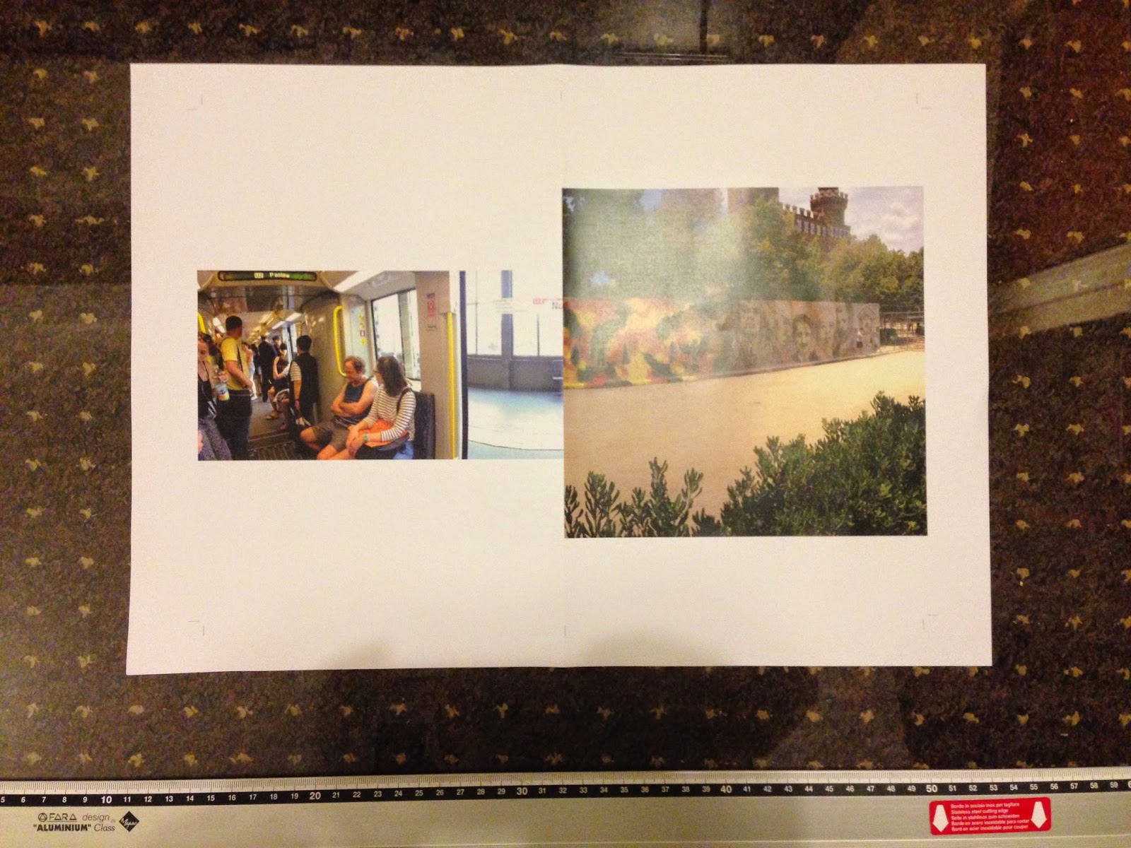
Using the zine printing equipment in the digital print room, I printed a mock up version of the panorama photo booklet so I could test the binding technique and get a feel for what the booklet will look like as a printed publication, compared to only seeing it on screen. The separate sheets are made up of half of each photo so that when the spreads are folded and bound, the pagination for print means the panoramas join in the centre fold when in order.
I hand folded, cropped and staple bound the booklet, using a guillotine to keep the edges straight. By doing this I learnt that it's essential to match up the folds so that the images that bleed across the centre run through perfectly so none of the image is lost. This is one reason why I want to staple bind all the booklets, as it allows each spread to be folded out flat so the whole photo is seen, something which is lost in perfect bound photo books.
Evaluation
- make A5 not B5; b5 is too big for suitable hand held size
- add info to back concerning series, copyright and possibly my own brand logo
- front cover development - hand drawn type or painted title to enforce personal aesthetic
Although I have used a continuous grey line to represent the ongoing journey and panoramic theme, I feel that this works as a way of connecting more than one photo zine into a collective series. I plan to use this on the back of every booklet to show continuity and present them under the same brand.


No comments:
Post a Comment