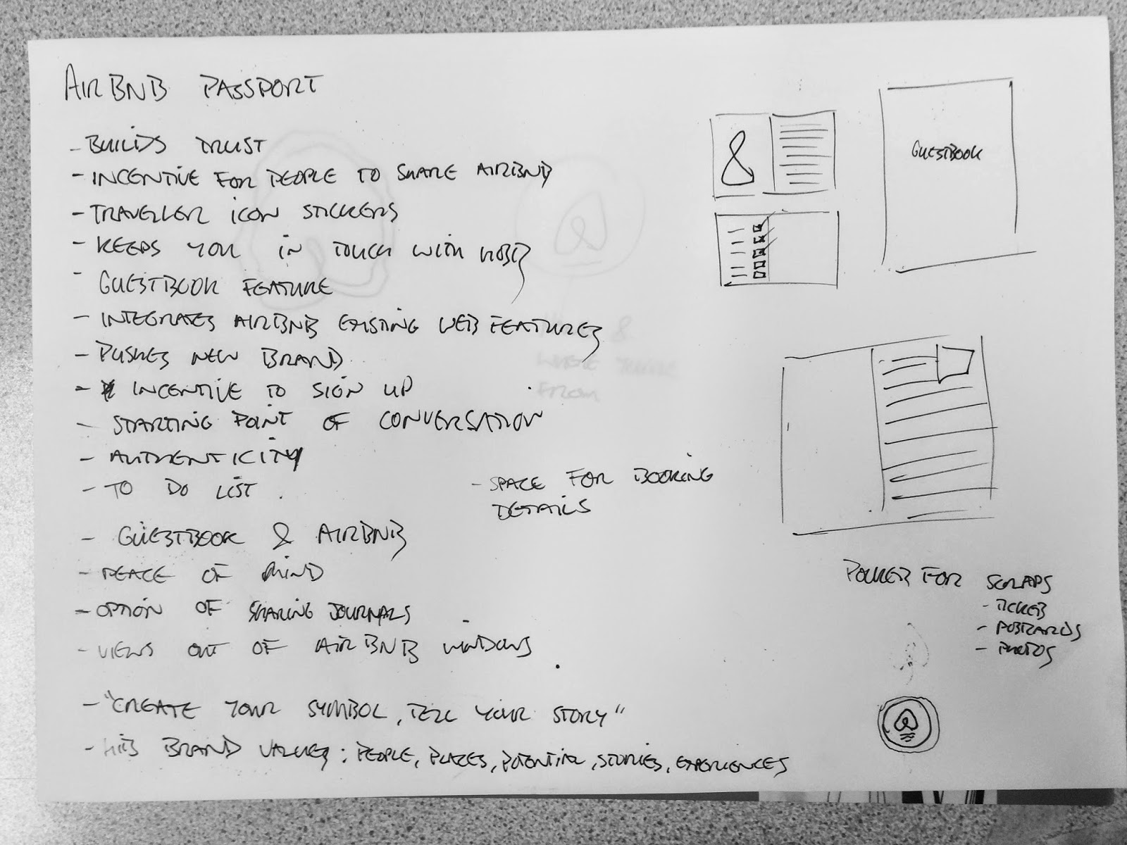
Together we created a mind map of ideas based on the idea of being welcomed home, belonging anywhere, and communicating with friends and family. We want to produce something tangible, as print has a quality that people can physically engage with making the experience more personal.
After much deliberation over several ideas, we weren't moving any further with them and kept going round in circles trying to come up with something innovative that Airbnb hadn't already included in their existing campaigns. Following the idea of leaving reviews and comments on peoples profiles, even a rating system or record of who has stayed where and with who, we came up with the idea of a passport style document where users could collect 'stamps' similar to that of the official passport document that we all have. Similarly to travelling with your actual passport where you can acquire stamps for each country you visit, the Airbnb passport allows you to get stamps from other Airbnb users to document who you have befriended through staying with different people on your travels. This therefore encourages the Airbnb community to grow, collecting messages and stamps from the people you host or the people you stay with, and this will naturally advertise the brand.
Advantages of using the Airbnb passport include an extra sense of authenticity and trust for each user; both hosts and travellers will feel connected through this common possession and gives them a starting point of discussion based on their travels so far or previous experiences as an Airbnb user. Each is personal to the individual and showcases their unique experience as a traveller. The guestbook would stay in the host's home, and contain only notes and messages from those who have stayed with that host - along with the travellers' sticker to mark their stay.
The pages of stickers would be kept in an additional pocket in the back of the passport, ready for use when exchanging messages and stamps. This sense of physical documentation differentiates from the online platform of most reviews of hotels today, and the tangible quality creates a more memorable experience; something that users can keep forever as well as uploading to their online profiles as a link between print and digital media. We talked about this as an augmented element to the design, whereby scanning a page of the passport on your phone would either take you to the persons Airbnb profile or give the option to upload pages of your passport to share your experience.
We were able to quickly mock up our idea for the front of each book, the guestbook in the blue/green colour and the passport in Airbnb's most prominent brand colour rausch, which would reinforce the association with the brand. We tried out a few variations for the positioning of the logo and text, and concluded that it works best with text as the logo alone doesn't explain enough. This has been done with as minimal information as we could while still explaining the purpose of the document. We agreed that the middle composition works best as it separates the logo with 'passport', which we decided looks better in the centre of the bottom.
Another feature we saw existed on the site is the ability for users to create their own 'bélo', (the name for Airbnb's logo), and this allows customers of Airbnb to choose their own colours and pattern, ensuring that each has a unique design specific to the individual's preference. This is something we could incorporate into the passport design in some way, as it further ensures significance to each person that uses Airbnb.
http://www.thedrum.com/news/2014/12/31/airbnb-harness-social-media-think-global-act-local


No comments:
Post a Comment