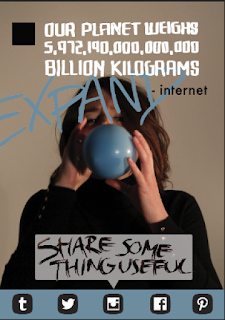
After a few sketches I started working on the computer to get a better idea of how the finished posters would look, considering the proportions of the canvas. Sticking with the idea of including different social media icons within the poster seemed essential to make the link with the social networks more obvious. Using the photos from the shoot as a background image I had the basis to add in text and other graphics to suggest the portrait scrolling device.
Using speech bubble text areas and a small square on the left side I gave myself the space to insert the main messages in a similar format to how they would be seen on a social media site such as Instagram or Facebook. Testing different opacities on the photograph worked well with the contrasting media in front of it, pushing the photo further into the background and not the most immediate point of focus on the poster.
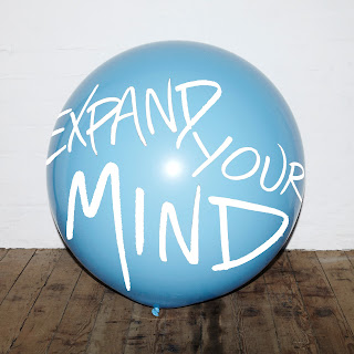
I chose three photographs from the series which conveyed the largest amount of change from first to last, making sure there is visible difference in the size of balloon, and that the whole of the model's face was covered in the end photo. The hand written text seemed most appropriate for the singular words, and though it's more prominent against the dark top, against the background made it appear to be a part of the image with scope to incorporate text over it without it being a problem if the words were slightly covered.
Sticking with the hand drawn aesthetic, I used varied styles to address different sections of text and took inspiration from the format of quotes, especially those seen on Tumblr, to enforce the idea that the information has been found on the internet. I later decided this was too vague for people to interpret automatically, so changed the name of the 'person' who posted it to 'Found on the internet', showing the source of the information, suggesting the audience can find similar facts and other information on the internet that's far more interesting than a lot of the posts usually shared.
Essentially the fact offers a short burst of information that the audience is likely to remember and may enlighten them to a new piece of information in their day. This offers a memorable element of the poster series which is more likely to stick with the individual, even if they don't know or remember what the posters are promoting.
I tried out some alternative slogans which kept the short, succinct message in an aim to create a realisation of the issue within the target audience. The primary use of hand drawn type throughout the entire posters further reinforces the link to off screen production and individual communication.
I still felt there was something missing and that the posters were a bit bland, so reconsidering the colour scheme seemed like an avenue for improvement. Changed the colour of titles to add a bit of contrast, choosing a red based orange to compliment the blue and appeal to the largest audience, relating to both genders by choosing a neutral style and colour palette. Ideally even more colours, or at least a variety of combinations, would enforce the concept further by expanding the colour range associated with the idea.
Added 'Found on the internet' as a name or heading for the 'post', as I found this was more relatable than the quote marked 'internet', as not everything on the internet is valuable or worthwhile information.
The centred content fits within a grid structure inspired by the central column on mobile network feeds, keeping the information justified aligned through the ability to adapt each letterform by hand. The series works as a set of three, using repetition as a way of the audience remembering and looking back at the posters, with more chance of actually taking note of them.
Final Designs & Mock Ups
The set of three posters will work next to or separated by a short distance so that 'expand - your - mind' will still be read as a continuous sentence, though the poster still works on it's own due to the other information. Similarly, the photo in the background shows the balloon expanding across the three posters to link the set together, which is a factor that will transfer to the digital GIF appropriate to be posted on Instagram and other social networks as a moving image, something that can't be replicated in print.
As shown below on Facebook the posters could be posted as separate posts or as one long post, so when the user scrolls through their feed they see the different stages one after another.
Additionally, the balloons would be seen as an installation piece and as a tangible product it draws away from the screen based adverts and media we see so much and catches the attention of the audience from another direction, away from phone screens. Having both the posters and balloons it targets the audience on two platforms, utilising the medium in which the message is intended to be looking at and bringing it to the real world where users can appreciate communication beyond the digital platform.
Evaluation
could have been a lot more developed to make a better final outcome
experimented with more colour variations


No comments:
Post a Comment