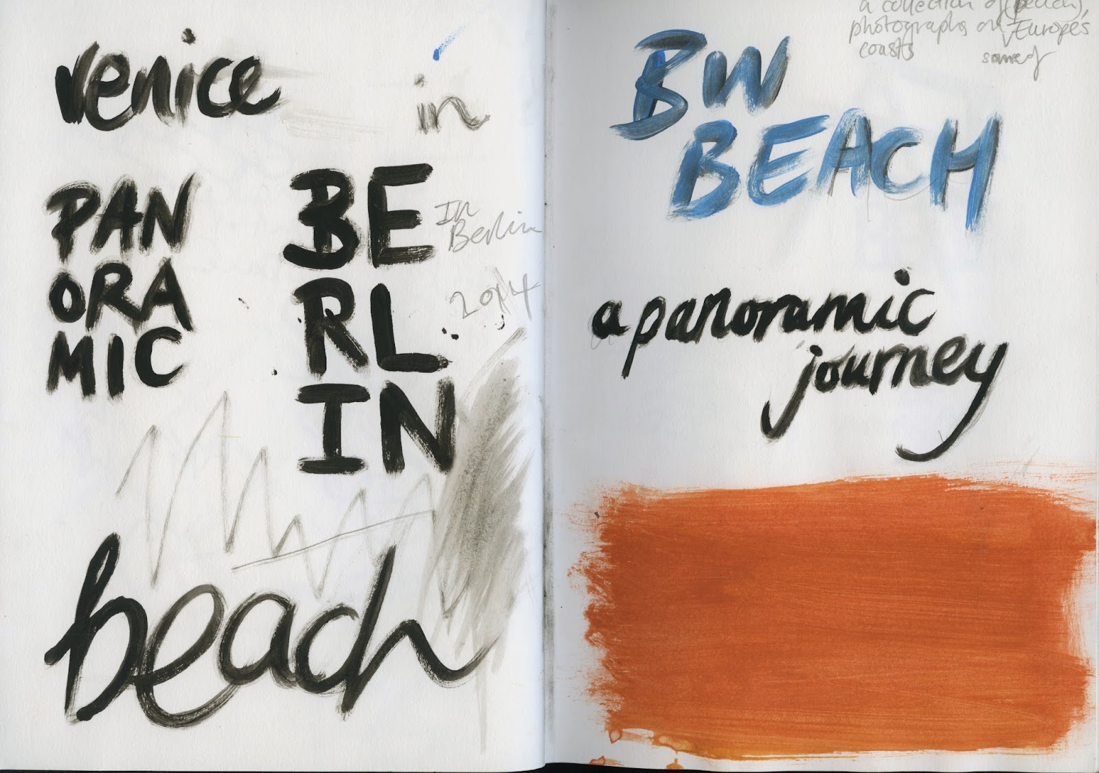
Although I know I want to use only typography on the covers, I need to try out a few different compositions and styles so the covers are suited to the individual booklet and are designed based on the particular series of photos. At the moment I'm working on hand drawn type and lettering in other modules, so have decided to incorporate this into editorial production, with the idea to use paint as the medium so the titles can be quickly produced and have a personal and informal aesthetic. This suits all of the photo booklets as the photographs are an insight of my trip to Europe and portray how I perceived the cities.
I tried to create compositions that represented an element of the theme of the individual zine. The panoramic journey title (for a booklet consisting entirely of panoramic photos taken on iPhone) is split up so that half of the title continues on the line underneath, from the other side of the page. This is representative of the extended vision that panoramas provide, and the continuous motion that exists when photographing in this mode on the iPhone camera.
Paint experiments
I painted a base layer which the painting titles will appear over - or in the foreground of - in white paint to contrast with the black background. Using only horizontal strokes to fill the surface colour of the board I managed to create a consistent block colour which I plan to scan in separately to the painted text overlay. To test out the composition and colour preferences I used a second board which I'd previously painted in the same way though not as thoroughly, to paint text in white over the top.
Still having not decided on the exact composition of the type I am using paint as the medium for experimentation at the moment - the styles of text for the covers may change. White text on brown board also gives me another variation I could incorporate, as the brown protrudes through the thin layer of white paint slightly, which I think fits with the booklet I chose to write for, containing photos of beaches. This might work well to use considering the photos in this zine are all black and white - the coloured cover may work well in contrast.


No comments:
Post a Comment