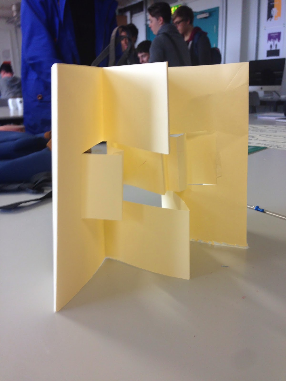
In today's session we began by using research materials and our own choice of stock to test out different folding methods and techniques to create a folded leaflet of some sort.
For inspiration, I started looking at unusual and interesting folded leaflets on Pinterest and Behance. Many ideas spanned from this including cut out areas of the fold, different shapes folded round each other, paper folded into shapes, and more.
Some shapes and folds I found particularly interesting are shown below:
I have tried to stay away from traditional folding nets such as the parallel, roll or accordion, in the attempt to create something more specific and relevant to my design process.
One I found that gives information about European architecture is designed appropriately for the content, adding to the overall context of the leaflet, shown below:
_____________
The next part of the session was to test out some of these folds on the stock we had, and by doing this individually we were able to see a large amount of other designs in a short space of time which was helpful as it practically shows you 40+ people's research, often different designs that you may not have found out about otherwise.
Here are some of the mock ups I created from my own research:
The first design I chose to try and replicate was a concertina fold, with a strip in the middle folding the opposite way.
This folds in this maquette didn't quite work as I'd planned, and when folded closed completely they didn't line up.


Another idea I had, and tried out on newsprint, was to have a square as the main base of the leaflet with other squares folding into smaller squares within the main one.
After trying out this idea practically, I realised a flaw in the design that the squares wouldn't fold the way I had expected them to when planning it out on paper.
Having trouble with more complex folds, I reverted back to a simple three fold leaflet, though with some slight changes to make it personal to my design process.

The third section to fold out is split horizontally into thirds as well, which signifies my organisation throughout the process, as I often categorise aspects of my work in design to clarify different sections of information.
The folds wouldn't necessarily have to fold back in the same way either - shown here the third separated part on the inner fold can be folded over the front to portray a certain stage as more prominent than others.
And this can be done with any / more than one section.
We did an exercise as part of the group to make ourselves more aware of the variety of folds we could try to replicate or develop into an individual design. Eight designs were chosen as examples, which were then voted on by the whole group as to which one worked best, or was the most interesting.
After this I was inspired to find some more interesting fold designs, and came across these two different examples:
The design above includes a cover that the leaflet slides into with a cut out section to show the information which is printed onto the leaflet only - the cover encloses and protects the leaflet keeping it together as one piece.
I like this fold because it plays with perspective so when partially open it reads Picasso and shows the image as a whole, whereas when opened further the image and letters are separated leaving space of text on the opposing side of the fold.
Resorting back to one of my earlier sketches, I decided to develop this into a design that was personal to the stages of my design process, as well as incorporating my own interest in architecture and geometry for the aesthetic elements of the leaflet. As I am the target audience for this publication the physical appearance of the leaflet can be tailored to my interests.
I've chosen an irregular shape for the leaflet as it reflects the modern architecture I found an interest in over summer in Europe. The leaflet folds around
I added a fastener on the inside of the last page which wraps around the leaflet and keeps it together by slotting behind the front piece which has a low cut.
To try and perfect this design with the fastening strap included, I made a maquette of a much smaller size to test the fold with it joined on to the original cut out.
When 'wrapping' the folds I also noted that it makes a small box shape an additional way to fold other than folding completely flat.


No comments:
Post a Comment