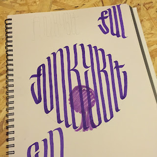
Due to the short time frame myself and Dan worked together on all aspects of the poster, initial ideas for the image from dan combined with my lettering to create a striking image. Placement of text and colour choices were made together, and I think this is the best way we work as it allows us to make quick decisions.
This image works as the hair is much larger than the head, allowing it to include the text without becoming too illegible. The style of writing is being kept quite abstract yet still reading 'funkybit', the name of the event. Image cropped to fill the space of the poster more suitably and made black and white so we had control over the colours. With no particular reason, other than the fact that we were both imagining this colour, we chose pink as the primary hue, combined with white.
Revisions for lettering reading 'Funkybit', the name of the event
I tried several variations of the letterforms to make sure that each vertical line was filled while still maintaining the correct letters in place. It isn't vital that the word is legible as we plan to use it in a typeface elsewhere on the poster, but this added visual effect informs the style of the poster.
Final design to be edited slightly digitally;
We decided to keep the triangular form of the woman's neckline in the composition, adding white shapes to fit more of the text in. Also played with positioning of text, keeping names of artists larger while address/ticket prices smaller and at the top, balancing out the colour over the canvas.
After deliberating the bottom of the poster for a while we went with horizontal pink lines as a background for white text, creating a three point visual diversion across the page and contrasting with the strong vertical strokes on the woman's hair.
Final poster design;
We then transferred the poster into landscape format for use on social media headers. Cropping the body out of the image and moving the text to the sides while keeping the dynamic diagonals brings the focus to the centre of the page and doesn't compromise the continuity of the promotional designs.
In use;


No comments:
Post a Comment