Initially, someone I work with wanted me to create a typographic tshirt design with his artist name 'Stray Weather' on. After showing him some initial layout designs (below) he decided he liked the idea of having Stray Weather written as a logo design, and he eventually disregarded 'is a poet' and commissioned me to develop his logo instead.
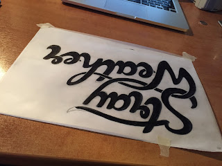
From here I took his interest in the script style with linking parts of the letterforms which created a unified word mark. I carried out several experiments with this attempting to create a balanced composition which attached both words without it looking awkward.
I noticed a lot of unevenness once I'd vectorised the letters and realised the logo as a whole wasn't very balanced, both compositionally and across all letterforms, including stroke width.
Going back to sketches I tried to nail down the direction, size and rotation of letterforms to create even spacing. Also looked at the negative space, making sure the text worked as a unified image.
In this image the letterforms stand more upright, and have thicker line weights. I feel as though I have moved backwards with this, and possibly the best way to move forward is to go back to sketches and create a more refined logo small scale making sure the balance is correct. This could require changing the shape of certain forms such as the W and links through the words, as well as the crossbar on the t of 'Stray'.
On the later design I've also adopted a curve under each word, and looking back at the earlier version it seems to work better in a straight line with letters slanted forwards slightly. However, I need to make sure it works as a logo mark - not sure if this is my personal taste but I feel it works better with thinner line weight as well.
Refinement
Went back to an earlier sketch and perfected it before vectorising then made smaller changes digitally such as spacing and line weight. This version keeps an even balance between the direction of strokes and space between letterforms. Tried to keep both a's, t's and r's almost identical to maintain consistency as a logotype. Here are the final designs;


No comments:
Post a Comment