Brief:
Produce a design or series of designs to be used on t-shirts and jumpers within a clothing range that focuses on raising awareness about dementia. Designs must have reference to or be inspired by the theme of dementia, though the creative outcomes are up to you. The proceeds from the event will be donated to Dementia UK to further help the cause.
Considerations:
The audience to target is not limited to a specific demographic, and should engage with anyone who would attend a catwalk event that aims to bring awareness to the cause. Consider how the designs will be transferred onto clothing; look in to textile prints and surface pattern if creating a full cloth pattern.
Deliverables:
Print-ready designs in format of JPEG or PNG,
Researching into the causes and effects of dementia was my starting point, and how it can change the human mind and body. Themes of uncontrollability, difficulty performing tasks, and personality change stood out as something that delineates the core reasons and problems associated with the disorder.
Looking at the mind as a muscle that changes with growth and time, led me to consider metaphors for the mind; how can you visually represent something that cannot be seen? Examples of such metaphors I started to think about included trees, earth, maps, hair, machines, wiring, and water. This seemed like an inevitable solution. I considered design that changes appearance from different angles - text that can only be read from one viewpoint and is otherwise obscured. A repeat pattern that isn't quite connected, reflecting the struggle to connect things that come naturally to normally functioning brains. Control loss and dis-order were common themes to play with visually.
Using images of the brain and cognitive functioning to visually represent mental illness and disorder, one path the project began to take was the comparison with mechanical processes and the break or disturbance within them. This was portrayed by working with continuous line, similar to wiring or piping that was either complete or damaged by including small breaks; essentially stopping the working flow.
After looking at images of the brain in order to try and form a visual representation of the mind, mental functions and dementia, the organic curved shapes apparent in brain scans influenced my decision to obscure text within the negative space of these shapes. I considered trying a mirror print, replicating the two halves of the brain as seen from above, though this wouldn't work as well when including text.
Originally I began writing the word 'mind' as a direct remark about dementia, but as I expanded my ideas, creating a more ambiguous set of designs was more appealing to further strengthen my concept of obscurity and difficulty of problem solving that many patients suffer from.
Feedback & Research
During the development process I asked peers and individuals unassociated with design and the brief to tell me what they saw when I showed them each image. The feedback I received stated that the designs were clearer from further away, which works well if they're going to be printed on t-shirts as the design will be able to be read from afar. Closer up however, is when it becomes more obscure.
With many respondents it took up to 30 seconds for them to figure out the word within the shapes, and this was partly due to not realising they had to look at the negative space to find it rather than the block shapes. This means it's important not to have the coloured blocks represent any letterform even mildly, as this could distract from the actual letter suggestions.
Some problems with the lettering and negative space were touched upon and resolved, making sure the words read what they were supposed to - in some experiments 'what' seemed to look like 'whole', something I wouldn't have picked up on knowing the word myself.
Using different levels of tones brought in the references to MRI imaging and brain scans, focusing on different colour to represent temperature and brain activity.
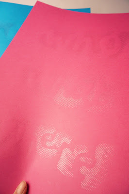
Digital renditions: By eliminating the inner content and increasing the contrast, the negative space between each of the shapes becomes clearer. Experiments with bitmap imaging using different distances and shape areas (dots, lines) allowed further distortion of the text, making it more difficult to read as an image. Closer up the text becomes less legible, whereas from a distance it can be read more easily, reinforcing the concept.
To screen print I made the design half tone, which kept the variance in tone from inside to out, though not split in to different sections. I tested a couple of different ones; lines, dots, etc.
Final Designs and Prints
Saved as PNGs the designs can be printed in any colour on to any colour. I've chosen white on black as the main design as I feel it gives a sense of eeriness or unknown which links back to the mind.
I tried out some metallic inks on the black stock which worked well and changed the visibility of the design in different lighting, which further conceals the text and designs, reinforcing the concept of obscurity.


